Install the app
How to install the app on iOS

Follow along with the video below to see how to install our site as a web app on your home screen.

Note: This feature may not be available in some browsers.


New Everton Stadium

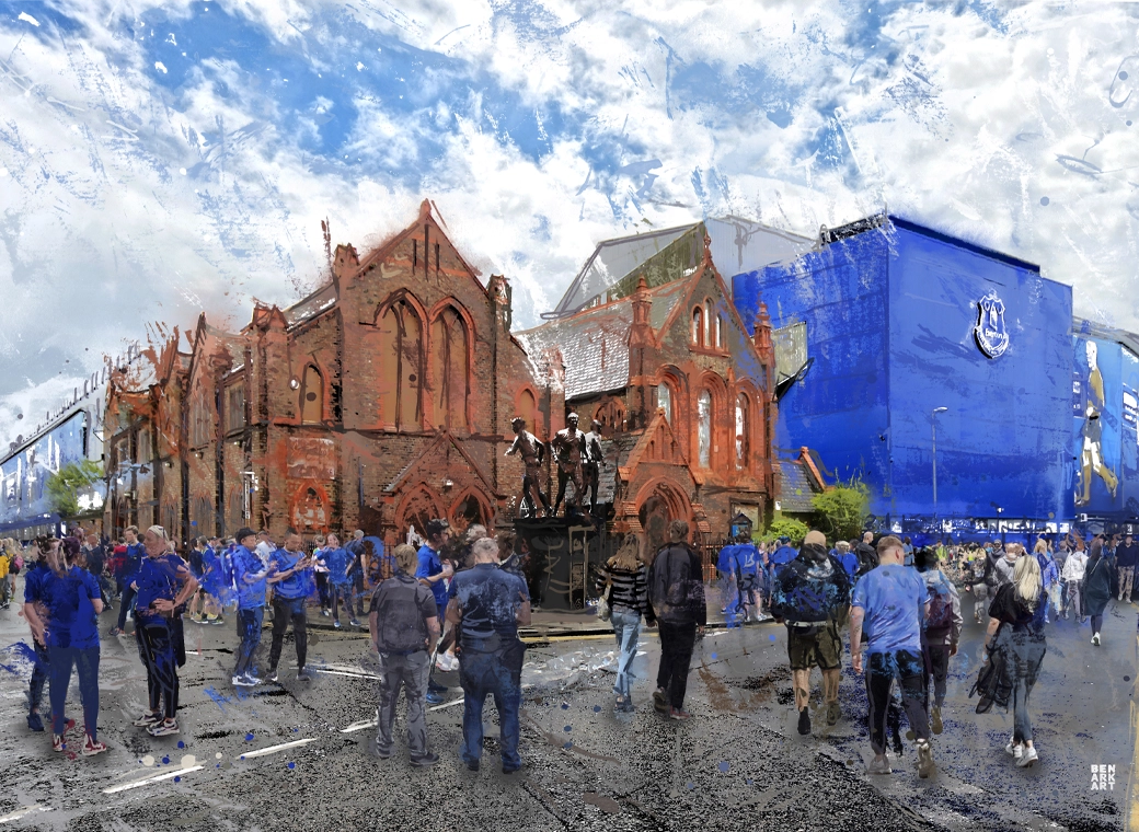
Surely Everton must be aware what a mistake it would be NOT to have a replica of this incorporated in the ground? Not some token gesture in the brickwork.

When you see something like this what do you see? What football club do you envisage?

Moving to a new home, apart from blue seats with white E V E R T O N written it it, what else would capture your imagination and
emotion and say "This is Everton. This is home"?

It's never too late, Everton FC

I've always believed that with the electronic hoardings that are likely to go up it could easily show a replica of the crosses when not showing sponsors.

Thanks @arch stanton
Don't you think the elevated corner sections where the wheelchair access was originally in the home end looks like it's disappeared though mate? In the smaller stand in the opposite goal you can see them quite clearly behind the goal and then large corner sections, but in the massive home end it just looks like they've been moved to the front rows either side of the goal.

I think the wheelchair section is there, it just doesn't look as prominent as on the original design (now divided into 2 smaller sections).

Old:

Screenshot_20210224-211803_People's Project.jpg


New:

Screenshot_20201002-233641_Gallery.jpg


20200924_190323.jpg


Ignore the arrows as that was just to highlight the step that has been introduced.
 
I've always believed that with the electronic hoardings that are likely to go up it could easily show a replica of the crosses when not showing sponsors.


I think the wheelchair section is there, it just doesn't look as prominent as on the original design (now divided into 2 smaller sections).

Old:

View attachment 170218


New:

View attachment 170219

View attachment 170220

Ignore the arrows as that was just to highlight the step that has been introduced.
Thanks mate, the pic with the arrows is the one I've seen (maybe you posted it originally and thats where I seen it)
 
What ever our sentiments, the club went with the smaller capacity. They went with basic stands, one behind another. There is no overlaps. There are no
double decker stands. Unlike early renders the 'main stand' isn't triple tier. The home end isn't one big stand. There is no Archibald Leitch latticework
on the east & west stands (even just a plastic cover or a digital version). There is no reference on there being a clock like the one that was at the church corner.

I'm less enthusiastic on the 'new' version than the original plans shown at St Lukes. But that's just my opinion. Could have been so much better.
Our cautious board never had the cahoonas to go all out for a bold stadium, with the 'wow' factor, they cut back.
Yeah, that first presentation was a genuine wow.

It's still decent and will look great from the outside, just completely standard as a modern sporting arena from your seat.

Honestly, it's the result of having 'nice' people on the board.

Be big, be bold, steamroller meek objections from faceless organisations into the pavement. Instead we had people fretting over English Heritage, UNESCO and adjusting to suit. It was utterly meaningless anyway, status lost. (UNESCO hadn't even visited since then Mann Island development opened up. Kopites blaming Everton for lost status seem blind to those architectural marvels)

The argument over cost holds little sway either. Even if the build went up to 6/700m its a lifetime cost.

Happy to be moving. Disappointed that after a couple of seasons it will just be another football ground.
 

Thanks @arch stanton
Don't you think the elevated corner sections where the wheelchair access was originally in the home end looks like it's disappeared though mate? In the smaller stand in the opposite goal you can see them quite clearly behind the goal and then large corner sections, but in the massive home end it just looks like they've been moved to the front rows either side of the goal.
On the screenshot of the PDF, yes - which is why I said screenshots of it aren't much use without zooming in!

Screenshot 2022-06-17 at 06.55.43.webp


There are plenty of accessible sections dotted round the ground, but you need to be able to zoom the PDF to see them.
 
On the screenshot of the PDF, yes - which is why I said screenshots of it aren't much use without zooming in!

View attachment 170226

There are plenty of accessible sections dotted round the ground, but you need to be able to zoom the PDF to see them.

Yep that section is still visible on the people's club app as thats the smaller stand isn't it.

Mad on the pdf the stadium looks so generic and crap but if you go on the app and put it into night mode it looks fantastic lol
 
Yep that section is still visible on the people's club app as thats the smaller stand isn't it.

Mad on the pdf the stadium looks so generic and crap but if you go on the app and put it into night mode it looks fantastic lol
Yeah, I think new stadia only have presence when they are full.

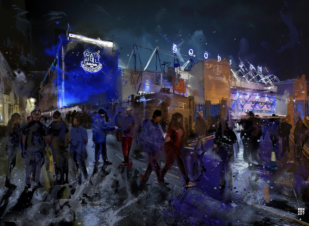
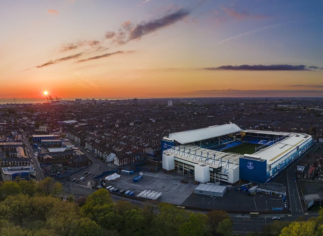
There’s so much to look at in an empty Goodison, all the different styles, the incoherent joins between the two old stands and the two newer ones, a church for crying out loud - and all of that is bound up with the memories of everything we and generations before us have seen there.

But a new, empty ground is a blank canvas - it’s much more visually coherent, not full of memories and therefore, I guess, dull.

The fans will change that when they are in, no doubt!
 
I’m not sure having those accessible area each side of the goal is a good idea with our strikers shooting capability and it may also reduce the ‘intimidation factor’ replacing 100 or so fans with the reduced numbers in that area.


And waits..
No, I'm with you there. I don't get the section in the church corner of the current Street End.

I get it, for years our less abled support was treated as an afterthought at best.

It's great that these fans and those caring for them will have a load of options at BM, but pitchside is a bit odd from a potential Injury perspective.
 

I was in the Al Rayyan stadium for the Aust v Peru playoff tonight. 45,000 capacity. Very impressive. The game was rubbish so I spent most of the time trying to take in how much bigger BMD might be. I’d say it will be similar in scale.

The gap from end line to stand will be about half this distance…
It's murder getting out of the bin Ali on a match night though.

Especially if the ping pong or volleyball is on too.

UTFF!
 
I've always believed that with the electronic hoardings that are likely to go up it could easily show a replica of the crosses when not showing sponsors.
Have noticed at many new stadia, Tottenham for sure, when there's a goal the electronic ads change to a 'goal' design. We absolutely should have the Leitch latticework displayed after every goal. Pretty much every Everton icon has an action picture with the latticework in the background and it should continue.
 
Have noticed at many new stadia, Tottenham for sure, when there's a goal the electronic ads change to a 'goal' design. We absolutely should have the Leitch latticework displayed after every goal. Pretty much every Everton icon has an action picture with the latticework in the background and it should continue.
That's a nice idea. I think Sunderland reused some of their Leitch balcony truss as decoration within the stadium concourses. Bar frontages etc. We could do both for some semblance of continuity.
 
What ever our sentiments, the club went with the smaller capacity. They went with basic stands, one behind another. There is no overlaps. There are no
double decker stands. Unlike early renders the 'main stand' isn't triple tier. The home end isn't one big stand. There is no Archibald Leitch latticework
on the east & west stands (even just a plastic cover or a digital version). There is no reference on there being a clock like the one that was at the church corner.

I'm less enthusiastic on the 'new' version than the original plans shown at St Lukes. But that's just my opinion. Could have been so much better.
Our cautious board never had the cahoonas to go all out for a bold stadium, with the 'wow' factor, they cut back.

It's true that it is a more basic version of that presented a few years ago. Which feels like a bit of a con in some ways. If the commonwealth games bid had been successful, then we probably would've got the bigger original.
 
I've always believed that with the electronic hoardings that are likely to go up it could easily show a replica of the crosses when not showing sponsors.


I think the wheelchair section is there, it just doesn't look as prominent as on the original design (now divided into 2 smaller sections).

Old:

View attachment 170218


New:

View attachment 170219

View attachment 170220

Ignore the arrows as that was just to highlight the step that has been introduced.
Not a fan of the accessible fans being on the bottom row. Hard to see and also can get blasted by the ball occasionally.
 

Welcome to GrandOldTeam

Get involved. Registration is simple and free.

Back
Top