Install the app
How to install the app on iOS

Follow along with the video below to see how to install our site as a web app on your home screen.

Note: This feature may not be available in some browsers.

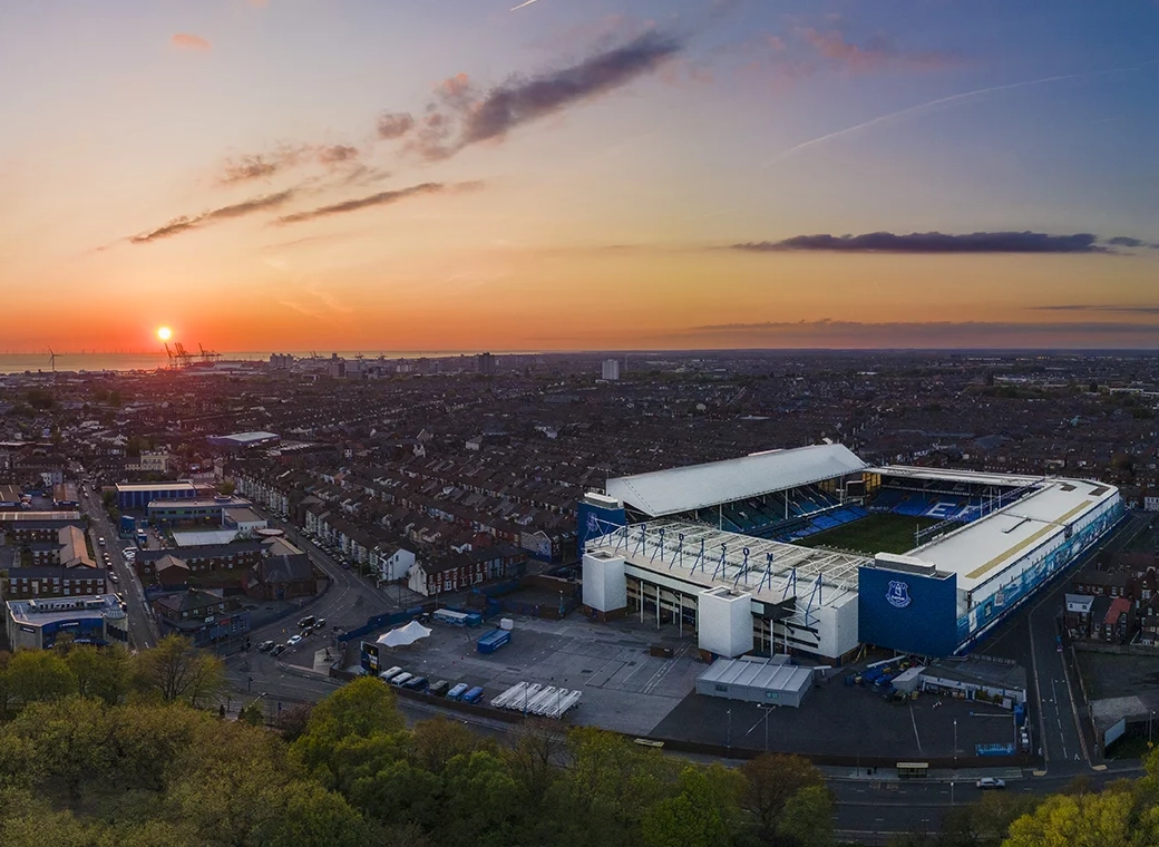
New Everton Stadium

The intent was always for it to look like it had grown from the ‘existing’ dock buildings iirc, and in that respect it definitely fits the brief.
Personally really like the contrast of old (effect) and new.
Looks like a spaceship landed on an old warehouse.

Indeed. I made a booboo in my post, where I said if it was all futuristic it would belong there, I of course meant wouldn't.

It's a good blend and while everyone might have little bits where they might wish it had this instead of that, overall it covers all the bases. It was meant to fit into a UNESCO heritage site and it has historical elements within the boundary it needed to be sympathetic with. To do that and still look modern and unique is a great job.
 
The roof is the breathtaking part of the design. I'm not a fan of the 'brickwork' facade of this stadium or the scores of metal panelling that break it up way too much. It looks unconvincing.
I’m with you on this. From many different angles and in different lights the barrel roof is a fantastic design and more than fitting for the waterfront location. You have to see it in real life to appreciate it (and we only have one range of real life close up views so far from the dock road). The stadium exterior it sits on I can take or leave, especially the mix of brick and black cladding. We’ll have to wait to experience the atmosphere, but if it as good as claimed by Meis then we’ll have a stadium to be proud of.
 
…..futuristic isn’t always better;

IMG_9817.webp
 

…..futuristic isn’t always better;

View attachment 267457

Looked better at night Eggsy.

IMG_8069.webp


However a lot of buildings like that fall into disrepair, the futurist further up aas the original site of “x in the city” (dunno what it was like), then it literally had a tree growing through it.

I can imagine some buildings are either knock it down and leave it empty for decades (see shenanigans on Tithebarn st) or build something that improve the economy to the sacrifice of the architecture and heritage.
 
Looked better at night Eggsy.

View attachment 267466

However a lot of buildings like that fall into disrepair, the futurist further up aas the original site of “x in the city” (dunno what it was like), then it literally had a tree growing through it.

I can imagine some buildings are either knock it down and leave it empty for decades (see shenanigans on Tithebarn st) or build something that improve the economy to the sacrifice of the architecture and heritage.

….yep, there’s a few night time ones of that terrace and it does look stunning.
 
It's all subjective. Personally I think the brick base and it's simplicity does a good job of reflecting the local and historic architecture without mimicking it in some tacky pastiche and as such allows the addition of the more modern and striking barrel roof and glazing.

I know you're more on the side of something modern Dave, but whatever your taste we know that we had to please a lot of statutory consultees on the design with what some will see as compromise and others will see as enhancement. Again, it's subjective. Pleasing Davek with a modern/striking design (or another section of the fan base with a more traditionalist taste) would not have got it built.

It's been mentioned a few times in the last few pages on here, but personally I think that the Lucas Oil Stadium is pretty ugly and (aside from the retractable roof and a larger capacity) has little going for it over ours. In my (subjective) opinion it is the "tacky" pastiche I refer to above. Something that the Americans seem to like doing in some of their architecture.

View attachment 267450
To me, it looks like that garbage shopping centre in Clayton Square, but bigger. The only thing I do like are the windows. I wish ours were like that instead of those black panels.
 

Interesting discussion on modern stadia design. I've always been far less interested in stadium exteriors than their interiors, and I've always felt that the internal arrangement is by far the main defining design feature. Yes, their are some notable exceptions such as the old Wembley towers for instance.... but generally, I think most of us can more readily recognise different stadiums by the internal views of stands etc. After all, most of us only view those stadiums for the moments it takes to access them.... then spend the next 2 hrs inside. The externals also do not affect the performance of the stadium in any way. Many of the world's greatest stadia have next to no external features of any note.... in fact, many shout functionality or austere blandness itself. The apparent message being that for stadia, the "good stuff" is on the inside.
 

Welcome to GrandOldTeam

Get involved. Registration is simple and free.

Back
Top