It was a managed vote, they knew very well which one the fans would choose. So little creativity. They didn't even vary the font or the tower illustration.The badge chosen is 1000000000000000x better than the other two!
View attachment 175777
Follow along with the video below to see how to install our site as a web app on your home screen.

Note: this_feature_currently_requires_accessing_site_using_safari
It was a managed vote, they knew very well which one the fans would choose. So little creativity. They didn't even vary the font or the tower illustration.The badge chosen is 1000000000000000x better than the other two!
View attachment 175777
It was a managed vote, they knew very well which one the fans would choose. So little creativity. They didn't even vary the font or the tower illustration.
I must admit the home shirt has grown on me having seen it in the flesh, but still not sold on the white armpits.Home shirt is alright, away and third are both awful
I just think we deserved better than one idea and two craptastic alternatives rustled up in Adobe Illustrator in 15 minutes.Tough crowd
I just think we deserved better than one idea and two craptastic alternatives rustled up in Adobe Illustrator in 15 minutes.
I’m glad they’re simplifying the badge. That’s all that’s needed. No need for 2 funeral wreaths either side of it.Yeah, our badge is cack. Marginally better than the fat badge it replaced, but nowhere near good enough.
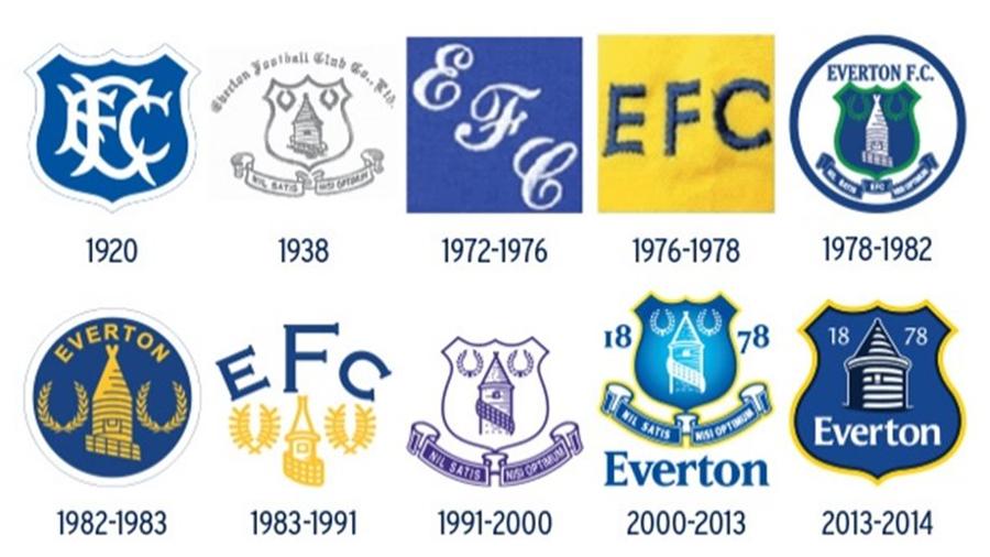
Personally, I'm a fan of the 83 - 91 crest. Modernise that a bit, maybe even remove the "EFC" and I think you've got something simple and effective.
I quite like the abstract version the club are using in their branding, but I'm not sure it should be on that shirt. It's a bit too simple.
Yeah the other two look like something you could create on PES 06It was a managed vote, they knew very well which one the fans would choose. So little creativity. They didn't even vary the font or the tower illustration.
Yeah but our Crest has fallenI’m glad they’re simplifying the badge. That’s all that’s needed. No need for 2 funeral wreaths either side of it.
Hasn’t it justYeah but our Crest has fallen
Reminds me of a margarine tub.....
Is stork margarine still a thing?Reminds me of a margarine tub.....
I do quite like it though, I like the badge, I just hate that sponsor.
It was 100% done to "force" the decision on which on we went with. And not even done subtly. The other two (along with the fisher price one that caused the uproar in the first place) were laughably bad. They all honestly looked like they'd been designed by a GCSE student in graphic design. The one we ended up with was the only *vaguely* passable one.Agreed ! Choice was somewhat limited !
Yep. I remember Dunc and Martinez at the time picking their favourite (the one which won) and I'm pretty sure Alan Myers (who was still working for the club at the time) has spoken out since about knowing the winner beforehand.It was 100% done to "force" the decision on which on we went with. And not even done subtly. The other two (along with the fisher price one that caused the uproar in the first place) were laughably bad. They all honestly looked like they'd been designed by a GCSE student in graphic design. The one we ended up with was the only *vaguely* passable one.