Install the app
How to install the app on iOS

Follow along with the video below to see how to install our site as a web app on your home screen.

Note: This feature may not be available in some browsers.


2022/2023 Kit Release

Status
Not open for further replies.
Yeah, our badge is cack. Marginally better than the fat badge it replaced, but nowhere near good enough.
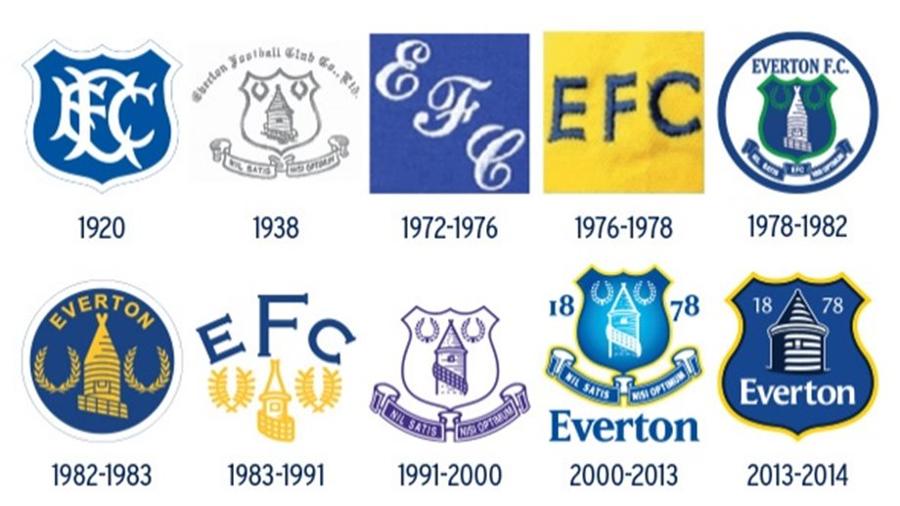
Crests.jpg


Personally, I'm a fan of the 83 - 91 crest. Modernise that a bit, maybe even remove the "EFC" and I think you've got something simple and effective.

I quite like the abstract version the club are using in their branding, but I'm not sure it should be on that shirt. It's a bit too simple.

Don't know why but the 1920 badge appeals to me, then the 1978-82 badge with green in ?, And lastly the 1991- 2000 badge.
 
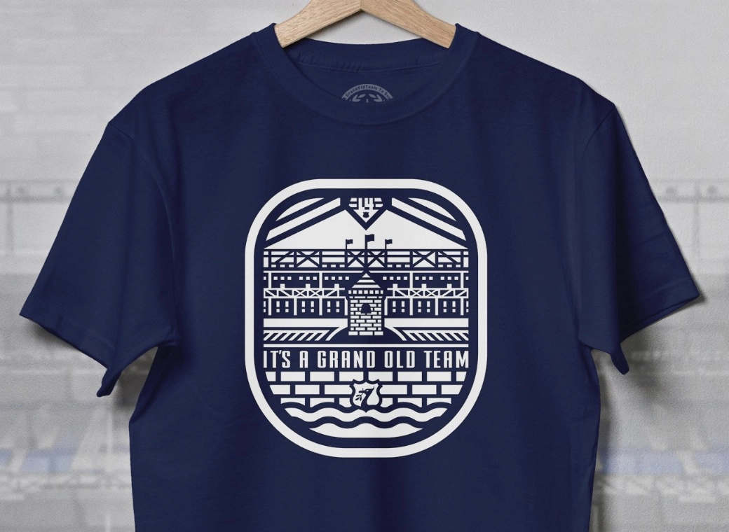
Not keen on any of this year's kits. I don't understand the obsession with the tower as a design motif.

I like the 1991-2000 badge the best, but without the blue background on the motto. I always prefer to keep things simple, and the new kits are just too busy for me.
 

Seem to remember the fans chose the latest badge...from three or four possibles?
I didn't vote so can't really complain !
 
Not keen on any of this year's kits. I don't understand the obsession with the tower as a design motif.

I like the 1991-2000 badge the best, but without the blue background on the motto. I always prefer to keep things simple, and the new kits are just too busy for me.
I actually like the new tower design for branding and publications. As someone else said though, its a bit simplistic to be used alone on a shirt.

Hard to see how a compromise between the two would work though. maybe just a putting E.F.C. above it in a nice font.
 
I actually like the new tower design for branding and publications. As someone else said though, its a bit simplistic to be used alone on a shirt.

Hard to see how a compromise between the two would work though. maybe just a putting E.F.C. above it in a nice font.
I like the little one on the back of the shirt, but the contrived patterns on the away and third kits spoil them for me.
 

Don't know why but the 1920 badge appeals to me, then the 1978-82 badge with green in ?, And lastly the 1991- 2000 badge.
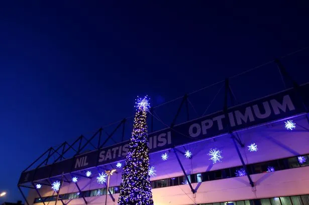
I think it all went a bit weird in 1991, when for some reason the designer thought it was a good idea for the tower to wear the fence around it like a sash. No idea why they hitched that up. Unless they didn't realise it was a fence.
 

Status
Not open for further replies.

Welcome to GrandOldTeam

Get involved. Registration is simple and free.

Back
Top