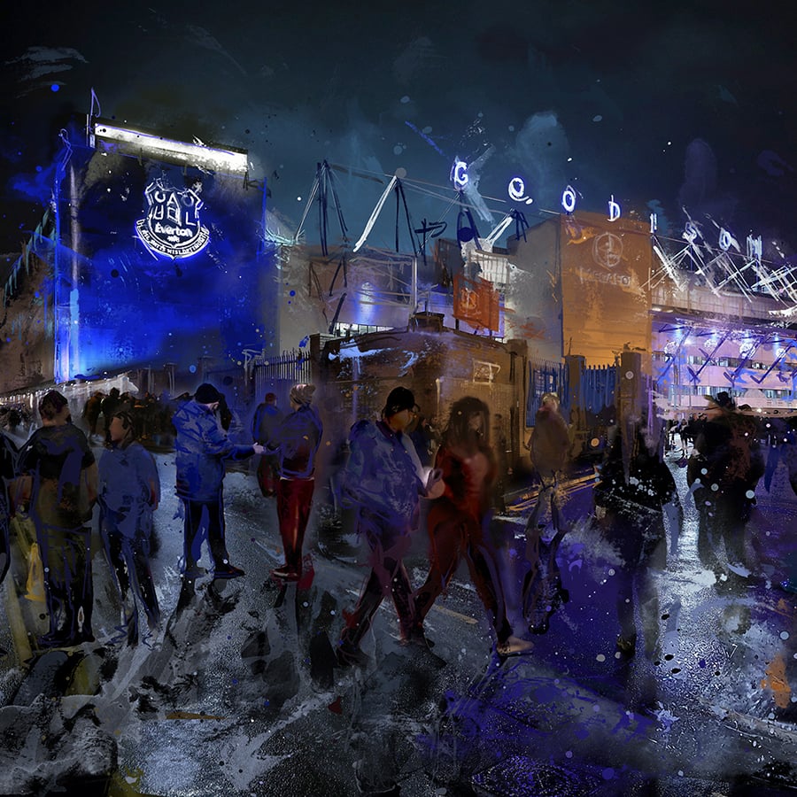
EvertonAndAustralia
Player Valuation: £750k
I'm really intrigued, how come you waited till you got home to colour it in?
Obviously don't bring colouring in pencils to uni
Follow along with the video below to see how to install our site as a web app on your home screen.

Note: this_feature_currently_requires_accessing_site_using_safari
I'm really intrigued, how come you waited till you got home to colour it in?
Is that your signature bottom right? hahahah
The rules that created the current badge will still be in place when the fans get "consulted" at the end of the season.
So the badge will still have to be contained all inside the crest, will have to say Everton 1878 and have Ruperts tower. Can't see them backtracking on the ribbon outside the crest.
I honestly think that all we need is to have a less cartoon tower, bin the yellow completely and try to get the club motto in their somewhere.
Think the only place the motto will fit in inside the crest at the bottom.


seriously...how do you post images in this forum?
The rules that created the current badge will still be in place when the fans get "consulted" at the end of the season.
So the badge will still have to be contained all inside the crest, will have to say Everton 1878 and have Ruperts tower. Can't see them backtracking on the ribbon outside the crest.
I honestly think that all we need is to have a less cartoon tower, bin the yellow completely and try to get the club motto in their somewhere.
Think the only place the motto will fit in inside the crest at the bottom.
I originally was going to have "EVERTON" in white, but I ended up doing it in yellow for it to stand out.I dont think its that bad...change the yellow to white maybe just have the tower and yearin the shield
Good effort though fella..better than i could do and the club imo
Personally I just want the laurel wreaths back and to have a less cartoonny tower. Not that fussed about NSNO but I seem to be in the minority so I added it in.
When I was drawing it I was trying to incoporate elements of my two favourite Everton badges (see below) and the one we had last season
Hence why I'm not overly fussed about not having NSNO on the badge. If it was completely up to me I'd like to see a return to one of the old badges I posted above
")

")