You are using an out of date browser. It may not display this or other websites correctly.
You should upgrade or use an alternative browser.
You should upgrade or use an alternative browser.
- Status
- Not open for further replies.
Debaser
Requested ban
I love Brennan's 'white' example above.
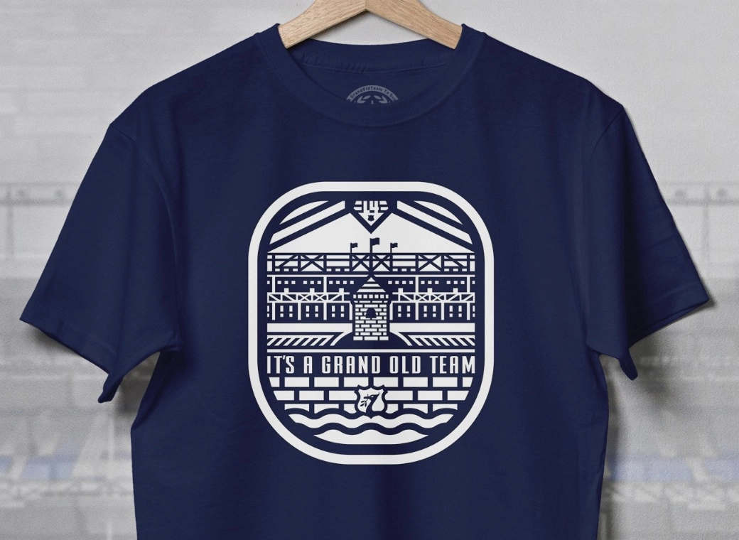
However, I would prefer it without the word Everton there. Just the 1878 under the tower would look great. I don't have Photoshop so cant post my ideas
Im a big fan of Borussia Dortmund, and love their simple round badge with BVB and the date. I know this would upset a lot of people omitting everything from the present crest, but I like it. Just EFC, large letters in a round badge with 1878 under it. Anyone?
However, I would prefer it without the word Everton there. Just the 1878 under the tower would look great. I don't have Photoshop so cant post my ideas

Im a big fan of Borussia Dortmund, and love their simple round badge with BVB and the date. I know this would upset a lot of people omitting everything from the present crest, but I like it. Just EFC, large letters in a round badge with 1878 under it. Anyone?
I love Brennan's 'white' example above.
However, I would prefer it without the word Everton there. Just the 1878 under the tower would look great. I don't have Photoshop so cant post my ideas
Im a big fan of Borussia Dortmund, and love their simple round badge with BVB and the date. I know this would upset a lot of people omitting everything from the present crest, but I like it. Just EFC, large letters in a round badge with 1878 under it. Anyone?
No. The core idea of the crest was to have Everton on it. People don't associate the tower with Everton. We aren't renowned enough. Until that changes, Everton has to be on the crest.
I hate it. See. Not easy.
I guarantee that the above would be far more popular than the current design, by simple virtue of the fact that it includes the Laurels and doesn't make the tower look like a beehive.
It's hard to [Poor language removed] it up as hard as the club did. It's almost impressive.
Pat's Van
Player Valuation: £70m
didn't have the motto included in the famous "simplified" 80's badge
doesn't mean it's not still our club's motto though, can live with it not being on the crest
if we're gonna include the name though I still think it should be in capitals, capitals are cool, iconic and timeless
just check out CLH FFS
doesn't mean it's not still our club's motto though, can live with it not being on the crest
if we're gonna include the name though I still think it should be in capitals, capitals are cool, iconic and timeless
just check out CLH FFS
I guarantee that the above would be far more popular than the current design, by simple virtue of the fact that it includes the Laurels and doesn't make the tower look like a beehive.
It's hard to [Poor language removed] it up as hard as the club did. It's almost impressive.
Looking at it, the tower is too skinny.
Marco Materazzi
Player Valuation: £8m
runlikehell
Player Valuation: £5m
didn't have the motto included in the famous "simplified" 80's badge
doesn't mean it's not still our club's motto though, can live with it not being on the crest
if we're gonna include the name though I still think it should be in capitals, capitals are cool, iconic and timeless
just check out CLH FFS
I would love to see a vote on how many would prefer to keep the motto.
It's not important to me, as long as our name, the laurel wreaths and Rupert's Tower are there for all to see I couldn't care less.
Cheers mate, I liked the yellow as it reminded me of the '85 kit.
Here's the white version next to it,

Like this one - however, I still think the bottom doesn't need to be that wide. I'd also drop "FC" from it and change the font, but basically yeah, this is the right sort of thing.
NSNO is secondary to a decent St. Ruperts tower and the laurels to me, but if it HAD to go, this would be the sort of thing.
HSD
Player Valuation: £6m
Our new badge after this one, there's still gonna be loads who dislike it. Would be ace if everyone had the same opinion! :')
But yeah, there's one going round on Twitter, and I've seen it on here, that loads of people seem to want but I personally don't like it, it just doesn't seem.... 'Everton' enough.
Oh, I'd hate to be the design team..
But yeah, there's one going round on Twitter, and I've seen it on here, that loads of people seem to want but I personally don't like it, it just doesn't seem.... 'Everton' enough.
Oh, I'd hate to be the design team..
Dell Boy
Player Valuation: £35m
The only way I can see this ending well is if there's maybe 4 or 5 options put forward (in addition to the existing one) and there's a straight open democratic vote! Anything else and this will just rumble on and on.
I think I might be alone in really wanting to keep the Latin though!
I think I might be alone in really wanting to keep the Latin though!
runlikehell
Player Valuation: £5m
The only way I can see this ending well is if there's maybe 4 or 5 options put forward (in addition to the existing one) and there's a straight open democratic vote! Anything else and this will just rumble on and on.
I think I might be alone in really wanting to keep the Latin though!
Would you be opposed to having it removed from the crest if the club insisted on having it embroidered onto the shirt somewhere?
Our new badge after this one, there's still gonna be loads who dislike it. Would be ace if everyone had the same opinion! :')
But yeah, there's one going round on Twitter, and I've seen it on here, that loads of people seem to want but I personally don't like it, it just doesn't seem.... 'Everton' enough.
Oh, I'd hate to be the design team..
Is it the round one which has a ring running around the outside with 'Everton' at the top and then in the centre has the tower ?
HSD
Player Valuation: £6m
Is it the round one which has a ring running around the outside with 'Everton' at the top and then in the centre has the tower ?
Ermmm it's round and has the Latin round the bottom quite small and and 'Everton Football club' round the top, and the tower and a wreath in the middle, and has '1878'.
I don't think I've seen the one you mean?
Dell Boy
Player Valuation: £35m
Would you be opposed to having it removed from the crest if the club insisted on having it embroidered onto the shirt somewhere?
To be honest I want it on the badge itself really.
- Status
- Not open for further replies.


