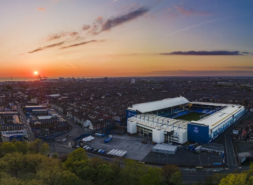
I love Goodison Park, but we need this new ground. Can't wait.
You are using an out of date browser. It may not display this or other websites correctly.
You should upgrade or use an alternative browser.
You should upgrade or use an alternative browser.
paulbefc
Player Valuation: £60m
Love the Kopites claiming it looks crap, when their stadium is in the most run down area of the city and looks like a paper hole puncher.
Both the design and the location are going to place Anfield firmly in the shade. When the final designs are out and they're forced to accept that, yes, this stadium is going to be on the banks of the river as part of the skyline as they feared and they're going to have to put up with everyone pointing that out, that it will see Anfield overlooked for major events, that it isn't going to be a converted athletics stadium as they'd hoped and in fact atmosphere was the main priority in the design, so it won't be a soulless bowl, that it will be full every week and yet still has the potential to hold 62k etc etc etc, they will head back to the last refuge of the bitter fan whose club has missed a trick: "Yeah, but you've sold yer soul tho lads, all yer memories have gone! Glad we're still at Anfield are spiritual home!!1".
Also - aren't we missing a massive trick by not having a roof? Not to revisit this point - but its really windy on the front, and by having a roof we can host more events
I am happy it looks to be moving on but, having told all my mates (non-blues) about Meis saying he was going to make "the best club ground in the world"I am a bit underwhelmed.. Purely on external aesthetics, it is bog standard, especially when compared to the new CHelsea and Spurs grounds.
I wanted thiese types:
View attachment 54417
View attachment 54418
View attachment 54419
Bowiensno
Player Valuation: Free Transfer
Chelsea’s proposed stadium is the ugliest thing I have ever seen.
Agree with that. In what will seems like the blink of an eye those eyesores will seem dated. Goodison is over 100 years old and has a soul. It’s time to move on but to somewhere with soul that will stand the test of time.
jerseytoffee
Player Valuation: £10m
Aren’t they the images that Meis said weren’t the fun bushed ones on Twitters while ago, so I think it will be much more spectacular than them
Blue Juice
Player Valuation: £25m
I think I've put my finger on what I don't like about it and its the massive Everton emblazoned across the front of it. If that's light and can be removed I reckon it would look much better, the text makes it look cheap
bol-uk
Player Valuation: £50m
But its different. Id rather that than ubiquityChelsea’s proposed stadium is the ugliest thing I have ever seen.
It doesn't matter what the design will be they will say it is awful anyway.Love the Kopites claiming it looks crap, when their stadium is in the most run down area of the city and looks like a paper hole puncher.
bol-uk
Player Valuation: £50m
The problem with a wonderful, aesthetically pleasing stadium @bol-uk, like you've shown above, is that they will come at a premium - a hefty financial premium.
While we're not one a shot-string budget, we aren't flush with cash and as such the stadium is what I would expect for the money we're able/willing to spend.
That's not saying that I don't want what you desire; rather, I believe that if we have x-amount of money to spend then we should firstly utilise it on atmosphere etc.
Ye, you are right, it just seems., starting with a beautiful blank canvas and with Meis' words ringing in my ear, to go with that design is a little dull.
GwladysBlue
Player Valuation: £70m
The other stadiums you posted loon brilliant, but Chelsea's just looks like a fried egg.But its different. Id rather that than ubiquity
We're still yet to see our final designs, too.
From what I've seen, barring the capacity, I like.
bol-uk
Player Valuation: £50m
Love the Kopites claiming it looks crap, when their stadium is in the most run down area of the city and looks like a paper hole puncher.
I am loving that
GwladysBlue
Player Valuation: £70m
When they're in that higgledy-piggledy mess of a stadium, which is all disjointed.It doesn't matter what the design will be they will say it is awful anyway.

