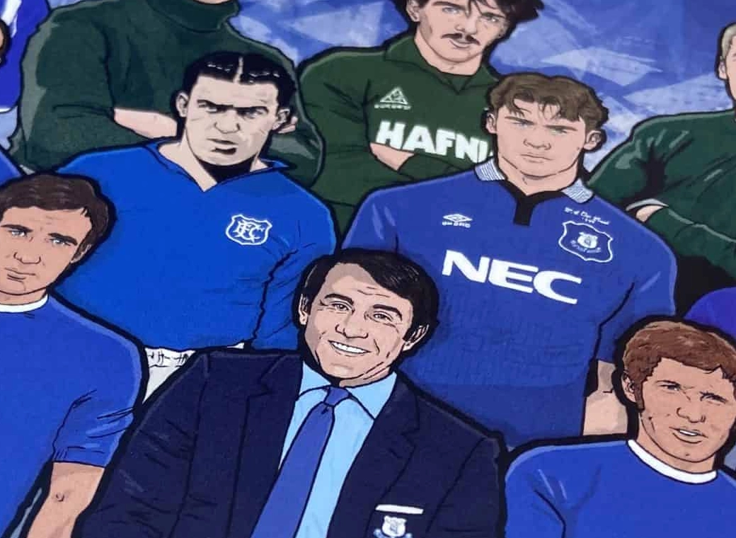
Not that old Pete ....... Hospital tomorrow dreading it ....,Nice to see @Joey66 at the end there......... lol
You are using an out of date browser. It may not display this or other websites correctly.
You should upgrade or use an alternative browser.
You should upgrade or use an alternative browser.
Muppet Basher
Player Valuation: £6m
I don't care if he does or not, as long as he is our friend in the back groundI don't see it, I used to think so, but I cant think of a single benefit in him coming out of the shadows.

brettangellnightporter
Player Valuation: £2.5m
Exactly. Build eyesores for foreign investors to sit on and overcharge rentals to the city's inhabitants. Historic england = old capitalistsSo, build more overpriced flats overlooking a derelict dock is their innovative solution.
toffee66
Player Valuation: £8m
The capacity is a compromise driven both by £ and by fitting within heritage and site constraints on elevations/roof and footprint respectively. It is not ideal but as others have noted it is still a big step forward.
I would not be that surprised if Jenrick waves this through & privately/publicly we get strong government support if we then do a Spurs like variation mid-construction to slightly enhance elevations to c 55-56k capacity. It would need revised planning sign off by LCC & another government OK but if we took this action we'd have tested that informally in advance & be confident of approval just like Spurs did.
As for leaving Goodison, game one at BMD will be the definition of mixed emotions. Excitement for a new start. Optimism for the future. A sense of loss that will be rooted in deeply personal memories, often including friends and family lost to us, for so many of us. I expect to blub like a baby despite the fact I'll be 57 if built to schedule. I won't be alone!
The binman chronicles
Player Valuation: £80m
Where's the most up to date pictures, if i may ask?
I will see if I can dig some of the better ones out, they are often 'restricted' views (typical when it comes to us and stadiums) where you can't see the whole bit you can see enough to know something is different than what we can see in the people's project app interior shots.
For instance the virtual desktop stadium you can see the bowl looks different. This first picture shows the accessible seating go further into the North stand (meets with the middle of the '8'):
The South stand you can see again from the accessible seating the shape has changed, the wall is not as big and meets somewhere under the upper tier of the main stand instead of in-line. There looks to be more seats in the corners because of this:
Of course you may think well these can be the old ones and what is in the people's project are the actual ones, but we keep on seeing these bits in any of the new pictures, like the infamous 'busy' slide:
The overhead shot:
These are all the same but different from:
Which is a good thing as the new pics look better and also seem like there are more seats.
Mkjjones
Player Valuation: £8m
Thanks for your time mate, very helpfulI will see if I can dig some of the better ones out, they are often 'restricted' views (typical when it comes to us and stadiums) where you can't see the whole bit you can see enough to know something is different than what we can see in the people's project app interior shots.
For instance the virtual desktop stadium you can see the bowl looks different. This first picture shows the accessible seating go further into the North stand (meets with the middle of the '8'):
View attachment 119102
The South stand you can see again from the accessible seating the shape has changed, the wall is not as big and meets somewhere under the upper tier of the main stand instead of in-line. There looks to be more seats in the corners because of this:
View attachment 119105
Of course you may think well these can be the old ones and what is in the people's project are the actual ones, but we keep on seeing these bits in any of the new pictures, like the infamous 'busy' slide:
View attachment 119106
The overhead shot:
View attachment 119107
These are all the same but different from:
View attachment 119108
View attachment 119109
View attachment 119110
Which is a good thing as the new pics look better and also seem like there are more seats.

Oxontoffee
Player Valuation: £225k
He used to play for us
Looks like mo salah to meThat's me at the bar in the ship & mitre basically.
peteblue
Welcome back Wayne
Not that old Pete ....... Hospital tomorrow dreading it ....,
hope all goes well mate....
I will see if I can dig some of the better ones out, they are often 'restricted' views (typical when it comes to us and stadiums) where you can't see the whole bit you can see enough to know something is different than what we can see in the people's project app interior shots.
For instance the virtual desktop stadium you can see the bowl looks different. This first picture shows the accessible seating go further into the North stand (meets with the middle of the '8'):
View attachment 119102
The South stand you can see again from the accessible seating the shape has changed, the wall is not as big and meets somewhere under the upper tier of the main stand instead of in-line. There looks to be more seats in the corners because of this:
View attachment 119105
Of course you may think well these can be the old ones and what is in the people's project are the actual ones, but we keep on seeing these bits in any of the new pictures, like the infamous 'busy' slide:
View attachment 119106
The overhead shot:
View attachment 119107
These are all the same but different from:
View attachment 119108
View attachment 119109
View attachment 119110
Which is a good thing as the new pics look better and also seem like there are more seats.
I wish they'd update the app properly. The old intro of the app was boss where you could go inside it and move it all angles.
I think where you mention there's more seats in the corners ( I think this was going to be for wheelchair users if I'm not mistaken ) it seems that there is 2 sections behind each goal on the front rows now where wheelchair users will be situated.
Mkjjones
Player Valuation: £8m
What? So if a player missed the goal it will rocket to some poor fella in a wheelchair and knock them to the floor? Not right that!I wish they'd update the app properly. The old intro of the app was boss where you could go inside it and move it all angles.
I think where you mention there's more seats in the corners ( I think this was going to be for wheelchair users if I'm not mistaken ) it seems that there is 2 sections behind each goal on the front rows now where wheelchair users will be situated.
What? So if a player missed the goal it will rocket to some poor fella in a wheelchair and knock them to the floor? Not right that!
I thought the initial corners looked boss but deffo looks like it's been changed to me.
Mkjjones
Player Valuation: £8m
I'm sure that the app has never been updated, none of the changes have actually changed on the app, that's the first design. Including the plaza and no car park though.I thought the initial corners looked boss but deffo looks like it's been changed to me.
I'm sure that the app has never been updated, none of the changes have actually changed on the app, that's the first design. Including the plaza and no car park though.
I think a couple of updates happened in the app in September mate but definitely nothing internally as it's all the same interior from the original so it's hard to really get a grasp of the changes.
Mkjjones
Player Valuation: £8m
Yeah, couldn't of put it better myself, disappointing that, hope they can get on top of this and update the app.I think a couple of updates happened in the app in September mate but definitely nothing internally as it's all the same interior from the original so it's hard to really get a grasp of the changes.
Deco
Player Valuation: £40m
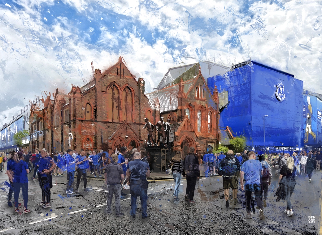
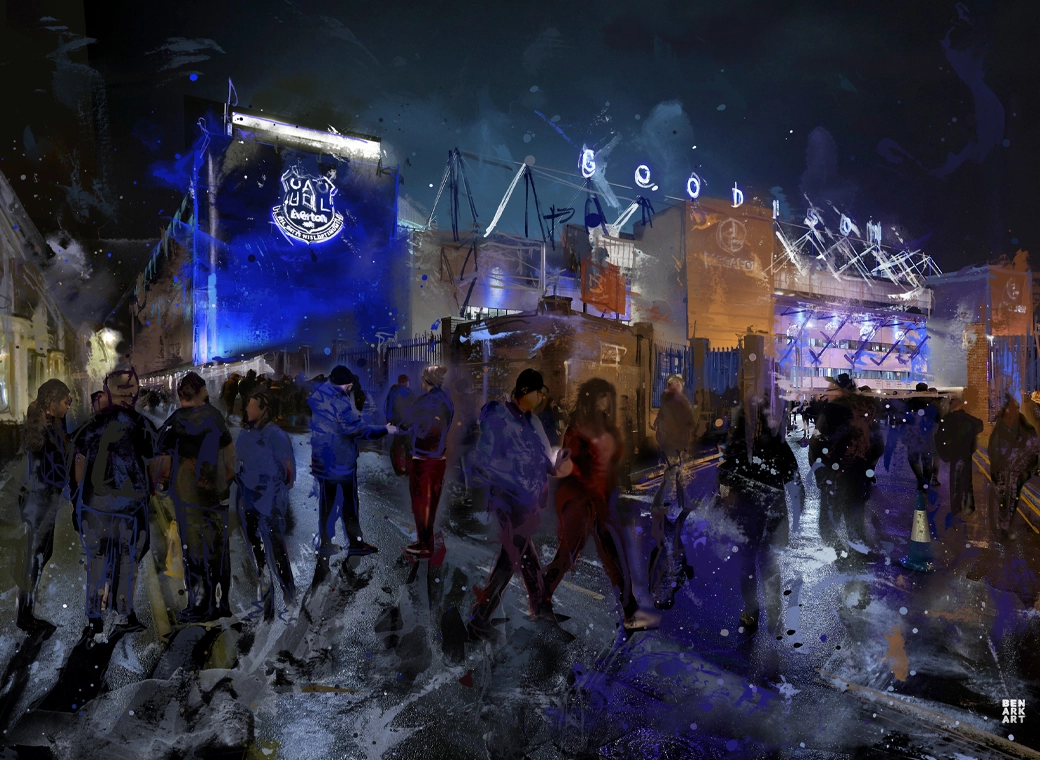
I think these scetches are fantastic, Meis says he will do some for auction for charity, would be great to have one of these
Brilliant - for all the grief Meis got I think he’s been great for the stadium.

