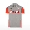
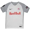
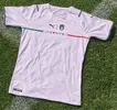
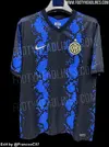
Here is the first run of the SN shirt and sponsor scorecard for 21/22, since you all asked:
Rankings:
5: Juve H, Ajax Marley
4: United T, Atletico H, Real H, Galatasary H, PSG H
3: Arsenal H, United H/A, Milan H, Dortmund H, Arsenal A, Leicester H, Marseille H
2: Chelsea H, Liverpool H, Barca H, Inter H, Leipzig H
1: City H
0: Spurs H
Grades:
Arsenal Home: lots of white but decent idea. If the stripes are navy this might come off well, but if black then it’s meh. Need to see the shirt worn for final score, 3/5
Chelsea Home: it’s an idea, and it’s not boring. I like that the shirt design matches the sponsor logo. Yellow on the sides is a negative for me so unless it comes together with the full kit, it’s got some problems, 2/5
Liverpool Home: I liked the emerald element to their 20/21 shirt, it fit very well. I’m not a fan of the salmon. Unless something pulls this together and it stands out when worn, it’s a clean design with poor color, 2/5
City Home: it’s a training kit, 1/5
United Home: the new sponsor will take some time for me to adjust, but it’s otherwise a fine kit, 3/5
United Third/light: I really like the colors and design here, unless the rest of the kit is bad and detracts from the shirt, this could be a classic, 4/5.
United Away/dark: seems like they’ve done this sort of combination several times in the past. It’s a solid color but generally uninspiring and needs the badge to match the colors on the shirt, 3/5
Spurs Home: unless there’s something I’m missing, this is the worst shirt I’ve ever seen, 0/5
Atletico Home: I absolutely love this, will need to see it in person but this looks like a classic kit right away, 4/5
Barca Home: I get the allusions to Catalonia, and I appreciate that, but the kit looks reductive, 2/5
Real Home: I love a white kit but generally find Real’s shirts boring, but if this has the pattern and colors shown, I can get behind this. The trim colors should ideally match the crest colors, and if they did this could be perfect, 4/5


