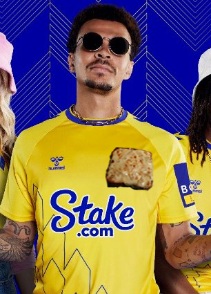
Looks sound that


well, personally I think it's bad design.As someone mentioned earlier I think the tower symbol is more likely to be used for street wear or casual clothing, t shirts, shirts etc. I’d rather have that, more subtle and an alternative to other designer brands.
For the kit it needs to be the full badge - no reason not to really.
Looks like he's on his holidays.
Looks sound that
Nearly 25% think the badge should be cheese & toast mate? don't think it counts for muchNearly 30% of Evertonians polled think the club is weaponising branding against the fans.
Hardly "uniting a global fanbase".
When the kit first leaked I dismissed it as, I figured the club wouldn't bastardise the logo. The club was very clear regarding their motivations for the crest rebrand a few years back. Changing it on the kit flies in the face of that. Outside the North West, very few people will know that third kit is Everton.
I think people are overthinking it though, I think it's as simple as going for novelty to try and sell a few more of the third kit. The club would never dream of removing the logo on the home or away kit...
I smell poopI think the board would love to kill off NSNO and the laurel wreaths if they could, also reference to the school of science. They symbolise Everton’s commitment to success which is a constant reminder of this board’s failings. Instead they seem obsessed with bigging up our history of firsts, being the people’s club, and the tower on anything they can.
Evidence of a fractured and confused fanbase.Nearly 25% think the badge should be cheese & toast mate? don't think it counts for much
Once again the club have released a kit design which has tampered with the famous club badge.
In recent years, depending on your perspective, we've either seen a steady evolution or slow erosion of the club badge.
Direction from the club could easily outline that the badge is fixed and not for redesign.
But, regardless of perspective, it's now clear that the badge is something the board do not consider sacred and perhaps that should trouble us - it's troubling many senior Everton commentators on this site and further afield.
As a result of our last badge controversy, the FA felt it necessary to introduce "club heritage protection rules" to “ put supporters at the heart of the decision-making process regarding these important club heritage matters."
Evidently, this latest redesign has not had "supporters at the heart of the decision" regardless of outcome and starts to make a mockery of the newly appointed fan advisory panel.
Are we starting to see a play out of the traditional Everton vs a 'new', 'bold' Everton (to adopt the terminology of our CEO) through the badge and an attempt to quietly erase Everton's successful past in an attempt to limit supporter expectation for the future?
In effect using branding as a weapon against the club's history.
The badge represents our expected standards, our history and identity. If deliberate changes are being made, we must ask questions of the club: why?
A bird on the badge?It’s very very important that you get yourself a bird
Shabba Ranks video here...Looks like he's on his holidays.
