As someone who has had to sit through countless boring and monotone branding meetings with my own digital company. Simplicity seems to be key for most modern brands. The more simple a logo, the more it can be adapted, even with things such as merchandising etc.
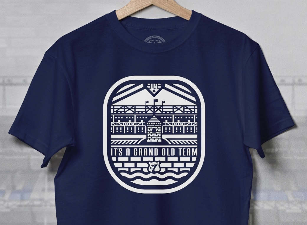
I love the tower concept as a badge, I don't think this new tower is detailed enough, it really is just a shape. With some detailing though, I don't mind this being the badge going forward, which it clearly will be judging by the fact that it's been plastered across everything we've seen this season.
I love the tower concept as a badge, I don't think this new tower is detailed enough, it really is just a shape. With some detailing though, I don't mind this being the badge going forward, which it clearly will be judging by the fact that it's been plastered across everything we've seen this season.


