Brilliant
You are using an out of date browser. It may not display this or other websites correctly.
You should upgrade or use an alternative browser.
You should upgrade or use an alternative browser.
- Status
- Not open for further replies.
If everyone promises not to buy one then I will defo buy one. Collectors items are worth a few bob aren't they no matter how
sh1t they are?
sh1t they are?
Okay, confession time. I've really come round to the new crest. Not only that, the old one is seeming more and more old-fashioned.
Anyone else feeling the same?
No. Thought not....
Like a Big Issue seller, if you don't look directly at it, its not there
Sorry mate, you're by yourself. Its so bad
As disgusted as I am with this current badge, I'm horrified at what monstrosity they might possibly create next season.
Alan Myers will be overseeing it next year, guarantee it'll be 10000% times better
toffeemeister77
Player Valuation: £6m
I still can't stand it. I keep thinking we are turning into Wigan !
sanctioned
Player Valuation: £2.5m
I think it's just you mate
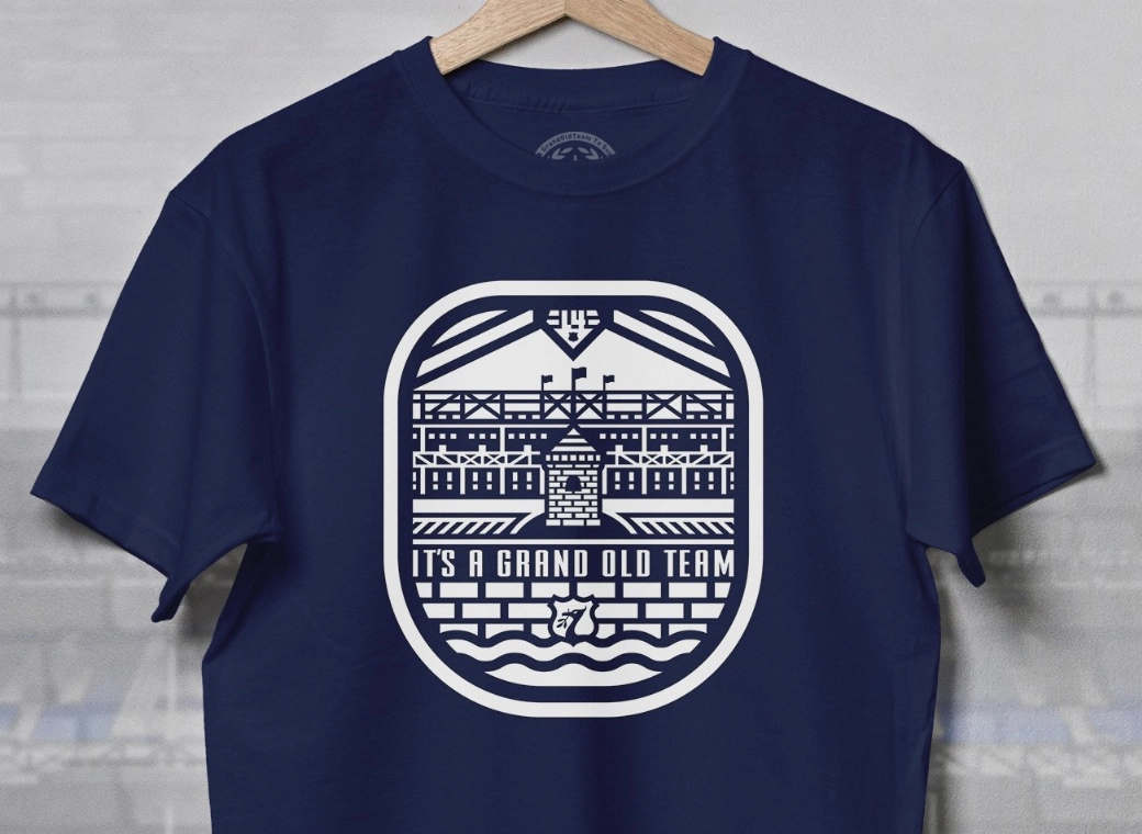
I'd like our badge to incorporate the tower (obviously), the wreaths and maybe just EFC and 1878. As much as I like the shape or the crest because it's so unique and people automatically associate it with Everton, I don't think it's absolutely necessary. Something like this would be boss:

That badge is really really nice.. why couldn't they have chosen it. Though, we still need to find room for NSNO also
JordanianEmbassy
Player Valuation: £5m
Its great isn't it. I'm pretty sure whoever did that design also did a version with NSNO on it, and a version that said "Everton" instead of E.F.C (which is a must according to the club ). They are online somewhere, I'll see if I can find them.That badge is really really nice.. why couldn't they have chosen it. Though, we still need to find room for NSNO also
JordanianEmbassy
Player Valuation: £5m
Ok I imagined the NSNO one - this is a similar effort with Everton instead of EFC though:Its great isn't it. I'm pretty sure whoever did that design also did a version with NSNO on it, and a version that said "Everton" instead of E.F.C (which is a must according to the club ). They are online somewhere, I'll see if I can find them.

AaronTheBlue
Player Valuation: £60m
Ok I imagined the NSNO one - this is a similar effort with Everton instead of EFC though:

This is the best.
BigBlueConk
Player Valuation: £70m
Its a nice looking shirt IMO.
Roger Milla
Player Valuation: £20m
There's no need to have 'Everton FC' on any badge. It doesn't need to be labelled as people should know, and if they don't know then **** them.
superkeeper
Player Valuation: £8m
No need for the 'Everton FC', could even put 'NSNO' instead.
- Status
- Not open for further replies.


