New Everton Stadium

Just bringing the images @Onwards Evertonians mentioned into here.

Looks like they've been made by Laing O'Rourke's in-house digital studio, Symmetry.

S03_Everton_Internalz.jpg


S03_everton_waterz.jpg


S03_everton_8z.jpg


S03_everton_7z.jpg


S03_cam-11z.jpg


S03_cam-02nz.jpg


S03_cam-01z.jpg


Absolutely brilliant renders. It's impossible not to be excited about this ground.

The roof looks amazing.


Usmanov had to trade in his yacht after getting sanctioned I see.
 

Just bringing the images @Onwards Evertonians mentioned into here.

Looks like they've been made by Laing O'Rourke's in-house digital studio, Symmetry.

S03_Everton_Internalz.jpg


S03_everton_waterz.jpg


S03_everton_8z.jpg


S03_everton_7z.jpg


S03_cam-11z.jpg


S03_cam-02nz.jpg


S03_cam-01z.jpg


Absolutely brilliant renders. It's impossible not to be excited about this ground.

The roof looks amazing.

Great renders.

That 'Everton' font though - ugh, I've always hated it. Just looks so basic and classless, especially with this oversized placement. It ruins the otherwise beautiful aesthetics.
 
You new here?


Welcome to the forum mate. Post lots.
Never be surprised by the stupidity of people.
To be fair, they said it is hard to visualise, and I can understand that with all the clutter on the playing area, even Mr.Drone was struggling for perspective.

According to Google the pitch must be at least 105m. long. If we assume that the rakers on the side stands are at 10m. centres - which seems reasonable to me - then you already have 110m. before you add on the straight sections of the North and South stands, which might give you an extra 10-20 m.
 

Great renders.

That 'Everton' font though - ugh, I've always hated it. Just looks so basic and classless, especially with this oversized placement. It ruins the otherwise beautiful aesthetics.
I don't think that will be there.

As others have said, the renders with the text on are of an older version of the design.

The most recent renders with writing, as used on the video on the new stadium Web site, have the present branding typeface:

Screenshot 2023-03-03 at 11.03.40.webp


Screenshot 2023-03-03 at 11.03.26.webp


Personally, I hope we don't see that, either.

I think we ought to have the confidence in our own identity not to do that.
 
I don't think that will be there.

As others have said, the renders with the text on are of an older version of the design.

The most recent renders with writing, as used on the video on the new stadium Web site, have the present branding typeface:

View attachment 205790


View attachment 205791


Personally, I hope we don't see that, either.

I think we ought to have the confidence in our own identity not to do that.
Agreed. A discretely sized crest would be more sensitive to the building and surroundings. No need for garish lettering. As presented currently, it is what you expect to see outside west end theatres.
 
Agreed. A discretely sized crest would be more sensitive to the building and surroundings. No need for garish lettering. As presented currently, it is what you expect to see outside west end theatres.
Yeah, I can’t escape the thought that it’s for cruise line passengers unfamiliar with football and the city. Basically a giant “no, this isn’t the stadium for the football club in Liverpool you’ve heard of,” sign.

It’s a bit insecure to yell it that loudly.

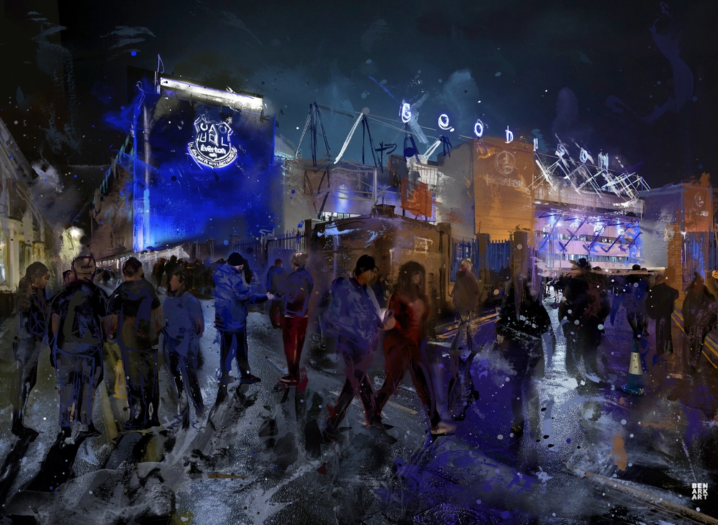
Personally, I quite like the ‘Goodison’ above the Park End. I think it’s pretty classy.

EAE4EE74-D206-4F06-A83F-A7BE98FC3B55.jpeg
 

Welcome to GrandOldTeam

Get involved. Registration is simple and free.

Back
Top