Cause and effect. The Everton backlash rocked them to their core.Your initial post says as a result of.
It’s not as a result of at all is it.
You are using an out of date browser. It may not display this or other websites correctly.
You should upgrade or use an alternative browser.
You should upgrade or use an alternative browser.
- Status
- Not open for further replies.
Me too. It's become a stick to beat us with.Iv wanted them to get rid of nil saris from the badge for ages
I always pretty much view the 3rd kit as a 'novelty/experimental' kit, so not that bothered about it really. But the crest has had a few incarnations over the years and the sky has not fallen down on us. Mind you, this change with the 3rd kit may be causing the heatwave ?
Well blues, which is your favourite crest from the past:

Well blues, which is your favourite crest from the past:
Saint Domingo
Player Valuation: £90m
I think the board would love to kill off NSNO and the laurel wreaths if they could, also reference to the school of science. They symbolise Everton’s commitment to success which is a constant reminder of this board’s failings. Instead they seem obsessed with bigging up our history of firsts, being the people’s club, and the tower on anything they can.
I honestly think it's a positive step in terms of simplification, but gone a bit too far. There's a boss badge somewhere in between. I imagine lashing it on the third kit was a move to see how many people wet themselves, then they'll do some survey accordingly, to settle on the new badge.
Also, once we stumble our way to another pot, everyone will soon shut up about our history.
Also, once we stumble our way to another pot, everyone will soon shut up about our history.
The badge has changed multiple times. No incarnation is sacred.
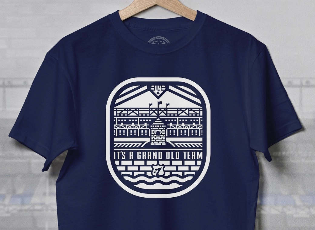
Secondly, the third kit is clearly being marketed as 'street wear' similar to say Venezia FC (although nowhere near as good) - just look at the imagery used in the advertising and the 'retro' design. The use of just the tower might be how the club envisage marketing the 'street wear' stuff over say normal club branding.
The club has properly identified that there is a gap in the market of young adults who wouldn't wear an Everton top, unless playing football or maybe to the match (I wouldn't even wear one to the match personally). The club are probs looking how they can get that section of the market wearing club merch as part of an every day look and thats why they have looked to jump on the retro shirt thing and create a new separate brand identify for it. Only problem with this is that has the massive Stake logo on it.
Ferguson1878
Player Valuation: £35m
Exactly we couldn’t be further from that saying if we triedMe too. It's become a stick to beat us with.
I like 83-91 and imagine a modernised version of that is what we're heading towards. Be well happy with that, me.I always pretty much view the 3rd kit as a 'novelty/experimental' kit, so not that bothered about it really. But the crest has had a few incarnations over the years and the sky has not fallen down on us. Mind you, this change with the 3rd kit may be causing the heatwave ?
Well blues, which is your favourite crest from the past:
Lob
Player Valuation: £50m
We complain that Everton need to be ran more like a modern day club and then we complain when they modernise the badge on a 3rd kit.
The one certainty in this uncertain world is that Evertonian's will always find something to be unsatisfied about.
Just a thought here but perhaps we all need to become more modern together.
The one certainty in this uncertain world is that Evertonian's will always find something to be unsatisfied about.
Just a thought here but perhaps we all need to become more modern together.

Daytripper
Player Valuation: £50m
Me too. It's become a stick to beat us with.
Rightly so. It hasn’t been adhered to at all.
ElGato
Player Valuation: £20m
91-2000I always pretty much view the 3rd kit as a 'novelty/experimental' kit, so not that bothered about it really. But the crest has had a few incarnations over the years and the sky has not fallen down on us. Mind you, this change with the 3rd kit may be causing the heatwave ?
Well blues, which is your favourite crest from the past:
Looks like an old navy tattoo
GoT vets; what was the reaction like in 1938 when we introduced the Tower? Was there a lot of bedwetting?
peteblue
Welcome back Wayne
91-2000
Looks like an old navy tattoo
GoT vets; what was the reaction like in 1938 when we introduced the Tower? Was there a lot of bedwetting?
Bedwetting…it started a world war the following year…..
Fedlingen
Player Valuation: £20m
Thought the same thing, if they could add some simple EFC branding/embroidering aound the tower and some subtle texture to the tower i wouldn't mind it.I like 83-91 and imagine a modernised version of that is what we're heading towards. Be well happy with that, me.
- Status
- Not open for further replies.

