Mr Happy
Player Valuation: £35m
Leverkeusen home and away 22/23 were very smart. They're inoffensive usually, and just a kit at the end of the day.Never liked anything castore have done to be honest
Leverkeusen home and away 22/23 were very smart. They're inoffensive usually, and just a kit at the end of the day.Never liked anything castore have done to be honest
So do I. Unfortunately they're starting to peel off my shirts. My favourite - apart from the changed badge that caused so much trouble - is the yellow and blue from 2013/14Haven't liked any of our shirts since Chang tbh. I miss the elephants
Their stuff always looks really cheap and poorly made to me. But, if they're offering the most cash then that's the most important thing, I suppose.Never liked anything castore have done to be honest
We don't have the revenue stream to miss out on even the little money kits bring in.I really liked the home kit this season. It had that touch of class about it.
I'm Really against the frequency that the kit changes. There is no point in it, it's simply a money grabbing ploy. We should keep a kit for at least 5 years particularly the home one. The away one maybe should change more often like once every 3 years.
To be honest, a lot of the kits you see on your average fan look pretty shoddy, whether it's Nike, Adidas, Hummel or whoever else it may be. It all depends on how well they are looked after and whether the wearer is in good shape.Their stuff always looks really cheap and poorly made to me. But, if they're offering the most cash then that's the most important thing, I suppose.
I like it as well Its all one color, and the correct shade too. No stupid yellow, white or black rim or lines, or pin stripes etc.I …..quite like it. Don’t hate me.

Tire tread from getting run over all of the timeIf accurate, does the pattern have some relevance that I’m missing?
View attachment 258323
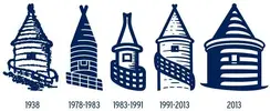
I'm not even a fan of our modern badge on the 3rd of the tower, it's too ambiguous we could of atleast had some detail on it likeI was just thinking about the decision making in the club the kind that led to the 2013/14 beehive badge. When they also dropped NSNO which might have been
an unsubtle change in saying what the club stands for.
I was thinking I bet they won't even come up with anything remotely sentimental with it being our last season at Goodison.
We'll see.

Our exclusive Everton pint glasses are a true collector’s item that pays homage to Goodison Park through iconic players who have graced the pitch over different generations.

The history of Everton FC in one image! “The best Everton thing I’ve ever got!”

A truly, wonderful piece which brings memories of visits to Goodison Park alive.

This print wonderfully encapsulates the magic of the ‘Goodison Under The Lights’.

A wonderful, A3 aerial print of Goodison Park.

A special, limited edition 1,000 piece jigsaw of the popular Everton Mishmash – The History Of Everton FC In One Image!

Introducing our Goodison Gang Everton T-Shirt.

Our newest Everton T-Shirt.

Everton champions, legends, and long-time servants assembled together in one squad photo!
 .
.