New Badge Soft Launch

Would you like it?

  • Yes

    Votes: 31 26.1%
  • No

    Votes: 74 62.2%
  • Not bothered Everton aren’t we?

    Votes: 14 11.8%

  • Total voters
    119

BullensRoad

Player Valuation: £15m
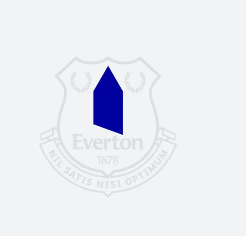
I think it’s pretty obvious they’re putting a soft launch to a new badge for the modern era.
IMG_4508.jpeg


It’s all round the new stadium, and currently on our third kits and corner flags.

Be interested to hear peoples views.

Personally I like the modern approach and minimalistic but recognisable allarensce, it’s something to move on with, especially with the new stadium.
 
I think it’s pretty obvious they’re putting a soft launch to a new badge for the modern era.

View attachment 248107

It’s all round the new stadium, and currently on our third kits and corner flags.

Be interested to hear peoples views.

Personally I like the modern approach and minimalistic but recognisable allarensce, it’s something to move on with, especially with the new stadium.

It's a pointed dildo or a silhouette of a stake about to kill a vampire. The 3rd kit this season would look boss with the proper badge on.


I think it’s pretty obvious they’re putting a soft launch to a new badge for the modern era.

View attachment 248107

It’s all round the new stadium, and currently on our third kits and corner flags.

Be interested to hear peoples views.

Personally I like the modern approach and minimalistic but recognisable allarensce, it’s something to move on with, especially with the new stadium.

Personally, I have absolutely no problem with a soft launch of a badge, it's the step into the modern world where simple is better.

My gripe is how simple they have done it, and they've got it massively wrong.

Look at how Man Utd, Liverpool and Arsenal have taken the key part of the crest and put it on their shirt.

St Ruperts Tower is symbolic of Everton Football Club and in such should be respected with the same detail. Its great to be on trend, but it should be done correctly and they've just messed it up for me.

1000081097.jpg
1000081098.jpg
1000081099.jpg
 
I think it’s pretty obvious they’re putting a soft launch to a new badge for the modern era.

View attachment 248107

It’s all round the new stadium, and currently on our third kits and corner flags.

Be interested to hear peoples views.

Personally I like the modern approach and minimalistic but recognisable allarensce, it’s something to move on with, especially with the new stadium.
It's crap. Absolutely crap design.

Nobody sees that blue arrow and thinks Everton or tower.
 

Top