It is just further insult to the fans IMO. It's comical.
You are using an out of date browser. It may not display this or other websites correctly.
You should upgrade or use an alternative browser.
You should upgrade or use an alternative browser.
- Status
- Not open for further replies.
It's the most recognisable minimalist drunk tank out there, I think it's good.
Bluerover
Player Valuation: £50m
I posted before it looks like the nib of an old scratchy pen from Dickens' time.It's crap. Absolutely crap design.
Nobody sees that blue arrow and thinks Everton or tower.
Horrible
Either design a new modern badge or keep it traditional, I don't like the mix of the two.
Fisher price , brown shoes
Jamiednm
Player Valuation: £40m
I think it’s pretty obvious they’re putting a soft launch to a new badge for the modern era.
View attachment 248107
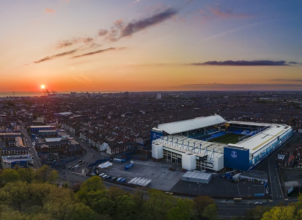
It’s all round the new stadium, and currently on our third kits and corner flags.
Be interested to hear peoples views.
Personally I like the modern approach and minimalistic but recognisable allarensce, it’s something to move on with, especially with the new stadium.
It’s literally been around for years.
Zatara
Player Valuation: £100m
I think it’s pretty obvious they’re putting a soft launch to a new badge for the modern era.
View attachment 248107
It’s all round the new stadium, and currently on our third kits and corner flags.
Be interested to hear peoples views.
Personally I like the modern approach and minimalistic but recognisable allarensce, it’s something to move on with, especially with the new stadium.
If theyre going to do that then they need to add details.
Otherwise, it looks pathetic.
The binman chronicles
Player Valuation: £80m
I would have loved to have been there a few years ago when they first went through these new designs with the club....
Hello Everton, it's Shyster and Shyster Marketing Services. We've come up with your new badge design. Our designers have worked on this night and day for months and yes it is very bold and brave like you asked us for. You wouldn't believe the blood, sweat and tears we put in until finally one of our best people had the inspiration of drawing 5 lines and filled the centre with blue paint. It was a magical process watching the sheer genius at work.
We hope you like it, that will be ten million pounds please.
It was horrendous but to be fair out of all the badges with the tower on it, it was this one that represents the tower to how it looks like in reality the most
Leave the badge alone yer blerts.
You've done enough damage.
You've done enough damage.
If it wasn’t for the EVERTON writing on the old badge would anyone other than a hardcore football fan see that and think Everton?It's crap. Absolutely crap design.
Nobody sees that blue arrow and thinks Everton or tower.
I’m not bothered if we have a cock and balls on the front I just want to see a winning team
Jacko93
Player Valuation: £35m
If it wasn’t for the EVERTON writing on the old badge would anyone other than a hardcore football fan see that and think Everton?
I’m not bothered if we have a cock and balls on the front I just want to see a winning team
Le Coq Motif?
Drico
Player Valuation: £60m
It's a dunce's hat in tribute to Moshiri with a touch of Klan to keep the traditionalists onside.It's a pointed dildo or a silhouette of a stake about to kill a vampire. The 3rd kit this season would look boss with the proper badge on.
- Status
- Not open for further replies.

