I think it’s pretty obvious they’re putting a soft launch to a new badge for the modern era.
View attachment 248107
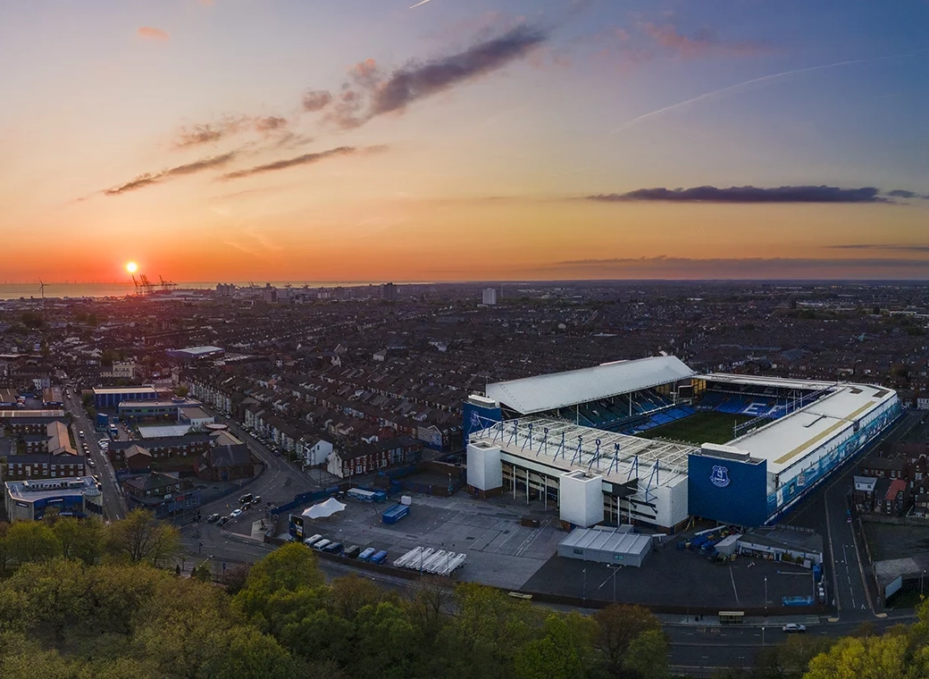
It’s all round the new stadium, and currently on our third kits and corner flags.
Be interested to hear peoples views.
Personally I like the modern approach and minimalistic but recognisable allarensce, it’s something to move on with, especially with the new stadium.
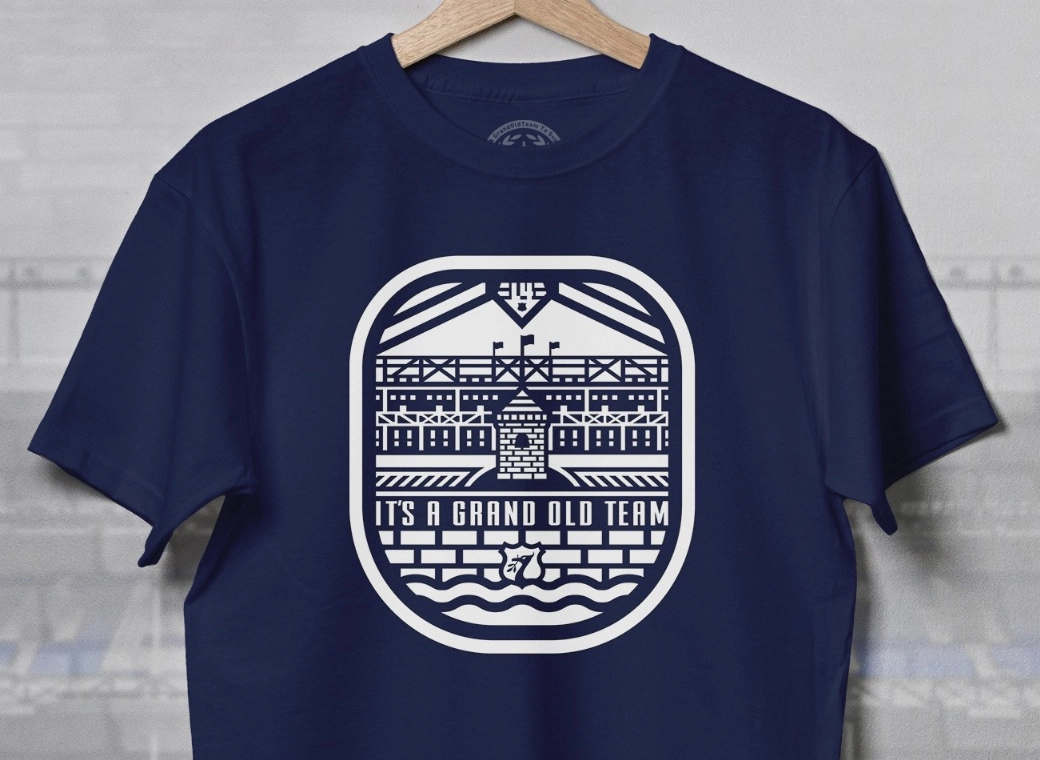
Hadnt thought this could be the reason they've went with that stupid version of the tower.
I really loathe it because they've used it in place of the crest - on merch, kits, season ticket cards - everywhere, replacing a crest which they not long ago they wisely rebranded to include the word Everton within the main body because, that was important. They then decided to bastardise their own logo.
I've never understood it but you could be on to something. I figure they've started moving away from it now though so reckon it was just a stupid campaign/temporary branding exercise.


