You are using an out of date browser. It may not display this or other websites correctly.
You should upgrade or use an alternative browser.
You should upgrade or use an alternative browser.
- Status
- Not open for further replies.
Bottle of red wine for after a poor performance.
Dreadful that.
9LeagueTitles5FACups
Player Valuation: £10m
Did the designer not consider that it looked like a bottle? It seems glaringly obvious to me at least....Bottle of red wine for after a poor performance.
Dreadful that.
Kever10
Player Valuation: £25m
Wanchors?
jerseytoffee
Player Valuation: £10m
It's a pottery kiln, they look like bottles so guess it's hard not toDid the designer not consider that it looked like a bottle? It seems glaringly obvious to me at least....
9LeagueTitles5FACups
Player Valuation: £10m
I just think they could make it look more like a pottery kiln - maybe change the shape slightly, add clearer borders etc.It's a pottery kiln, they look like bottles so guess it's hard not to
jerseytoffee
Player Valuation: £10m
It’s very basic, more like a brand logo than a club badge, similar to the alternative badge we have on the third kit.I just think they could make it look more like a pottery kiln - maybe change the shape slightly, add clearer borders etc.
Less detail the easier to manufacture and keep costs low I guess
9LeagueTitles5FACups
Player Valuation: £10m
Yes, I agree with that. For me, these badges are too simplistic and abandon features which supporters hold dear. Whilst some badges could do with watering down or modernising, most are fine and shouldn't be tampered with.It’s very basic, more like a brand logo than a club badge, similar to the alternative badge we have on the third kit.
Less detail the easier to manufacture and keep costs low I guess
Davideeyore
Player Valuation: £35m
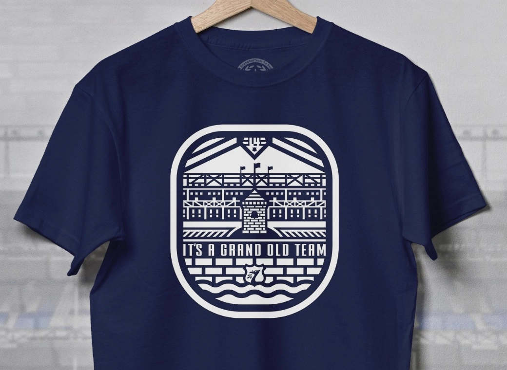
I think it’s pretty obvious they’re putting a soft launch to a new badge for the modern era.
View attachment 248107
It’s all round the new stadium, and currently on our third kits and corner flags.
Be interested to hear peoples views.
Personally I like the modern approach and minimalistic but recognisable allarensce, it’s something to move on with, especially with the new stadium.
The monolith.
This is what's effing wrong with the football club. If the idiots who come up with this are listening then just GTF out of the football club.
This is why the club is so poorly run. This is why we're so bad with merchandising. This is why we're so bad with communication.
I am so looking forward to a new owner who (unlike Moshiri) will sweep the club and bring new focus and drive.
Tom Hughes
Player Valuation: £15m
I see it as complimentary minimalist logo to the badge and not a replacement. Both can exist. Think of the Levi Straus jeans leather badge print design and the simple tag or V-shaped pocket-stitching. They can compliment and reinforce "the brand" identity....
The binman chronicles
Player Valuation: £80m
I'd go ballistic seeing that if I was a Stoke supporter.
Magus
Player Valuation: £8m
The whole point of using the tower is recognition of the birthplace of the club, so even a modernised version should be recognisable as a nod to the building. I don't see why they couldn't incorporate a line or gap to indicate the base of the roof at least. Or maybe the window ?
JamesEFC
Player Valuation: £10m
That’s the issue for me, no problem with them simplifying it really if it actually resembles something of a tower!The whole point of using the tower is recognition of the birthplace of the club, so even a modernised version should be recognisable as a nod to the building. I don't see why they couldn't incorporate a line or gap to indicate the base of the roof at least.
Dublin blue 75
Player Valuation: £50m
Towering Inferno of late more likeUp the Towering Toffees?
- Status
- Not open for further replies.


