New Badge Soft Launch

Would you like it?

  • Yes

    Votes: 38 21.6%
  • No

    Votes: 110 62.5%
  • Not bothered Everton aren’t we?

    Votes: 28 15.9%

  • Total voters
    176
Status
Not open for further replies.
I think it’s pretty obvious they’re putting a soft launch to a new badge for the modern era.

View attachment 248107

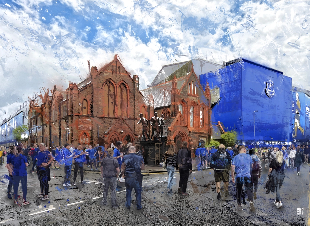
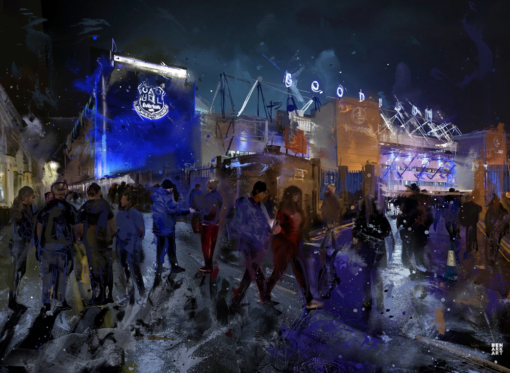
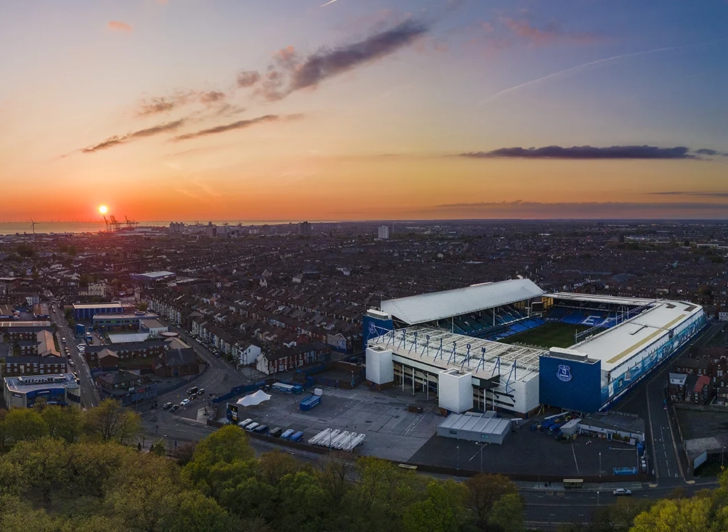
It’s all round the new stadium, and currently on our third kits and corner flags.

Be interested to hear peoples views.

Personally I like the modern approach and minimalistic but recognisable allarensce, it’s something to move on with, especially with the new stadium.
Put it centrally on the shirt and replace Nil Satis Nisi Optimum with Head Goes Through Here. Actually, should have had that when we had Barkley.
 

It's built into their site and they have an SVG icon used in various places, like the footer, where it's referred to as "icn-everton-tower" (i.e., icon: Everton Tower). It was created two years ago, along with a new font called Rupert Condensed, by a firm called DixonBaxi.

They haven't done anything like the crest, but if they did, it would end up looking something like this, which looks like a big silly face. I don't think they'd incorporate it into the crest.

I'm inclined to think they intend it only for specific contexts, which is really common in design. It's an abstraction of something recognizable, not a replacement for it, so that you can convey the brand more widely, like in iconography, small pieces where the details would be easily lost, etc..

1717172425453.webp
 
It's built into their site and they have an SVG icon used in various places, like the footer, where it's referred to as "icn-everton-tower" (i.e., icon: Everton Tower). It was created two years ago, along with a new font called Rupert Condensed, by a firm called DixonBaxi.

They haven't done anything like the crest, but if they did, it would end up looking something like this, which looks like a big silly face. I don't think they'd incorporate it into the crest.

I'm inclined to think they intend it only for specific contexts, which is really common in design. It's an abstraction of something recognizable, not a replacement for it, so that you can convey the brand more widely, like in iconography, small pieces where the details would be easily lost, etc..

View attachment 259014

no mate looks like something i’ve drew

only slightly better

noooooo
 
  • Like
Reactions: den
Anyone know what the laurels mean?

Think they’d be great next to the new badge.
Every discussion of it says that Theo Kelly included them as traditional symbols of winning, generally.

But if they were meant to signify winning anything in particular, I would guess it would be the two FA Cup wins (1905/06, 1923/33) preceding the badge's introduction in 1938. I know from reading of the club histories (either in Faith of Our Families or the Official Everton Autobiography) that in those days, the FA Cup was more prestigious than the league. No one cared that Liverpool won the league, but the city erupted for Everton's FA Cup win in 1905/06.
 
Everton is the tower and the laurel wreaths. Should just be those and it would look great. Just the tower by itself isn’t recognisable enough.

100%

It is exactly that. Since 1938.

Not only are these Richard Heads at the club meddling with the identity of Everton FC but also it is what is recognisable all over the world. They're sending out the wrong messages.

Please Everton STOP with this soft arse promotion you know what the club crest is, with NSNO as well, stick to. ;)
 

At this point in time I’d not be fussed if we stuck a dildo on the badge so long as Mosh and his crypto felons did one and the club was bought by someone with sensible intentions and deep pockets.

On the badge though, if they are going with the silhouette of the tower, I’d rather have EFC underneath and the two laurels either side. Hate the need to have our full name on the badge, not quite Burnley MS Paint tacky but it’s still tacky.
 

Status
Not open for further replies.

Welcome to GrandOldTeam

Get involved. Registration is simple and free.

Back
Top