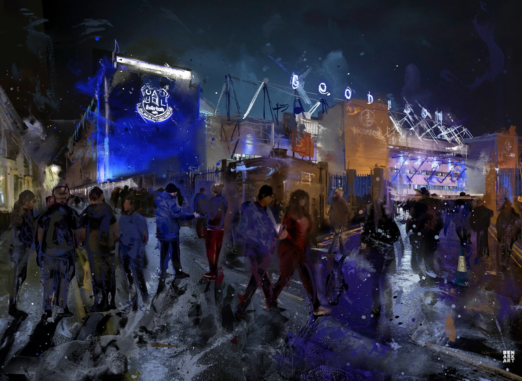
When I first saw the announcement on the Everton iPad app I was shocked as I knew nothing about it. I then saw the comments all of which were rich in vitriol and hate for the new design. I am a change fan and I thought surely the new badge can't be that bad....however when I saw it I had to agree its absolutely amateurish at best. It's awful, the shield is too heavy, overweight in fact and looks ancient against the other badges of famous teams who will be at the US tour in the summer, embarrassing.
I do agree that the current badge is cumbersome and has unnecessary items on it (Everton outside the badge, the pointless wreaths, the inaccurate jailhouse...the roof, width and fence totally inaccurate, and the complicated 'sash/scroll, holding our famous NSNO logo). So I agree change and modernization would be ok...if we knew about it and got a say in it but we do need to keep our traditions.
If you look on the Everton website at all the crests side by side, the current (nowoutgoing) one however is still easily the best version, the 'new' one looks like it came from the 70's and a kid drew it after a few shandys. Not just a PR disaster but a marketing one too, as the old crest is still highly prominent and visible on all Everton websites and apps....a shambles and rightly a laughing stock. Sort it Everton, admit an error of judgement and before it costs even more to put it right later, let's reinstate our badge now until a proper modern crest can be agreed upon.

