You are using an out of date browser. It may not display this or other websites correctly.
You should upgrade or use an alternative browser.
You should upgrade or use an alternative browser.
Kit for 24/25
- Thread starter Pazza
- Start date
Is that badge on the sleeve the only bit of Everton branding? Ugly trackie as well.
chrismpw
Player Valuation: £70m
They only get that money if people choose to pay it.Going to be pretty empty in the club shop this season.
kenada_blue
Welcome to Barcelonaton FC
Probably cost about £10 to manufacture
Will be less than that
kenada_blue
Welcome to Barcelonaton FC
While I'd point the finger at Castore...it's the going price of most football clubs.
Current championship club example...
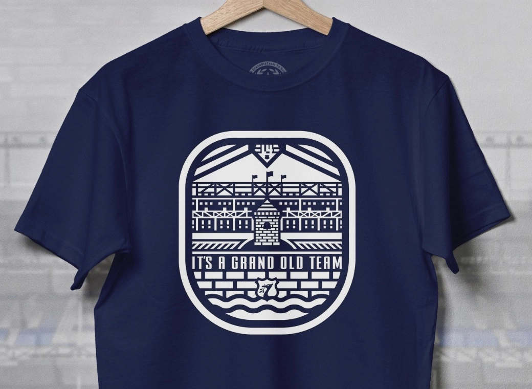
We need to make our voice heard to be honest about the crestIt wouldn't be too bad if the Tower had a bit more detail like the one below, but maybe with "EFC" underneath.
Not giving them a penny unless they have the kits in the sale like Hummel pricesGoing to be pretty empty in the club shop this season.
Magus
Player Valuation: £8m
I think that is missing the point. The Liver Bird was already famous as the emblem of the city, and LFC's success has made it even more famous in football circles, but the club chose a more local landmark in recognition of its roots in that part of the city,and I have no problem with that.Would be more recognisible with the laurel wreaths.
I absolutely detest this 'tower' being promoted by the club. It's nonsense. Prince Ruperts Tower might be synonymous with us (fans) but the wider football world don't know what it is apart from being part of the crest. I think the club must think it is just as famous as a liver bird it just isn't.
But as I said if it's with the laurel wreaths then everyone will recognise it. At the moment it's just a monolith. Equally completely unconnected to PRT.
The tower is recognisable to our fan base, and if they wish to simplify the crest I think this version can serve the purpose - wider recognition will only be achieved with success on the pitch.
That crest is a million times better than the current away one featuring matty's half eaten yellow crayonIt wouldn't be too bad if the Tower had a bit more detail like the one below, but maybe with "EFC" underneath.
Davideeyore
Player Valuation: £35m
I think that is missing the point. The Liver Bird was already famous as the emblem of the city, and LFC's success has made it even more famous in football circles, but the club chose a more local landmark in recognition of its roots in that part of the city,and I have no problem with that.
The tower is recognisable to our fan base, and if they wish to simplify the crest I think this version can serve the purpose - wider recognition will only be achieved with success on the pitch.
Your opinion.
I'm simply saying the splodge that is on the current 3rd kit and being put forward on many videos by the club has absolutely no connection to Prince Rupert's tower.
My point about the liver bird is that they have it as a simplified version, like the old 70's & 80's kits, rather than their overgrown crest. Now that works, because everyone knows what it is everyone can recognise it. So from that point of view it works for them.
This fat crayon means absolutely nothing.
I saw some example on twaddle X which actually works. In fact I've seen a couple (the one above). Personally I think it should have the laurel wreaths.
Does anyone know why they're dropping the laurel wreaths?
For me this is a gimmick like the 2013/14 crest it's come from someone outside the club who's just thought, yeah that's make it nice and modern and simplified. Utter buffoon.
Last edited:
OneTrueLegend
Player Valuation: £35m
It wouldn't be too bad if the Tower had a bit more detail like the one below, but maybe with "EFC" underneath.
In terms of the badge, that’s 10 times better than the one we actually have on the current away kit.
For me, if it just has the Laurel wreaths either side of the tower it would be spot on.
To me the laurel wreaths either side of the tower are at the heart of the badge. I think any football fan would recognise that as, Everton.
Big Sams Undies
Player Valuation: £20m
The “Pro” version of the shirt will have been manufactured in minuscule numbers compared to the “Replica” one so that’s not surprising from an availability point of viewThe kits are already selling out. The pro home has gone and only selected sizes in the pro away.
Magus
Player Valuation: £8m
I agree with you about the crayon, that's why I prefer the more figurative version, but including the laurels defeats the object of simplification.Your opinion.
I'm simply saying the splodge that is on the current 3rd kit and being put forward on many videos by the club has absolutely no connection to Prince Rupert's tower.
My point about the liver bird is that they have it as a simplified version, like the old 70's & 80's kits, rather than their overgrown crest. Now that works, because everyone knows what it is everyone can recognise it. So from that point of view it works for them.
This fat crayon means absolutely nothing.
I saw some example on twaddle X which actually works. In fact I've seen a couple (the one above). Personally I think it should have the laurel wreaths.
Does anyone know why they're dropping the laurel wreaths?
For me this is a gimmick like the 2013/14 crest it's come from someone outside the club who's just thought, yeah that's make it nice and modern and simplified. Utter buffoon.
I'm not saying I agree with changing the badge, but the tower is the key element to maintain the local connection.


