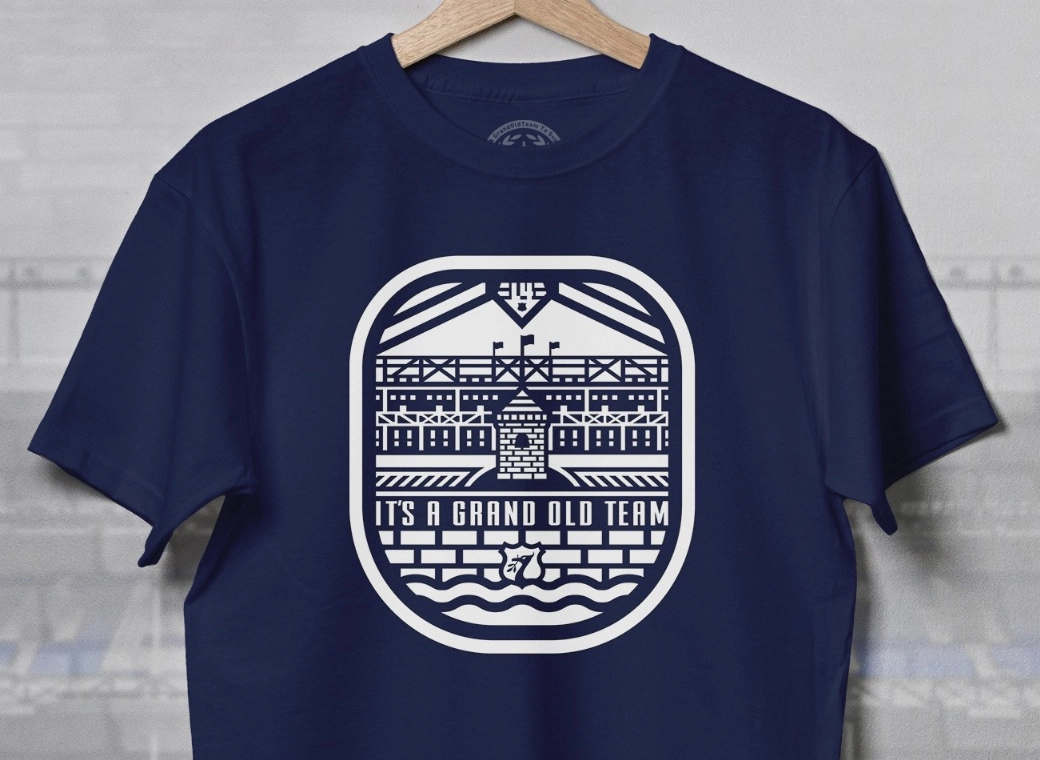
Tbh I quite like that we have a crest/symbol that just the fans know - "if you know, you know", but either way, ppl will get to know it over time, and how well that happens depends on the club, and our success on the field. A bit like the "new" Juventus badge - if you show anyone who doesn't know (Italian) football well they will probably struggle to name what club it is, but we all recognise it it now. (This is one modernisation I still dislike btw - the old badge was soo much better, as is our tower crest imo.)It's counter to everything they'd said when changing the crest. Even in their apology a over the crest a few years back when they launched the options to vote on, they said - "Our solution, in a globalised, technology-led world – was to present one word, loudly and clearly – EVERTON" - this clearly isn't the case with a tower in isolation.
Don't mess with the crest, don't butcher it and ensure Everton is within the main body. Pretty much every club has rebranded to do exactly that - generally circles with club name within. I understand it.
I suspect the only motivation for changing the tower, would be for it to be cheaper/easier to produce.
People who aren't an Evertonian - pretty much everyone outside of Liverpool will have no idea whatsoever whose that kit is.
It was like when they sent it as a car sticker to season ticket holders - waste of everyones time. Nobody where I live have any clue what that modern tower is.
Exactly. McDs logo is super basic. A stylised M/arches, that is it, but everyone around the world knows what it is/who they are.I agree with this actually.
Not against simplifying logos/badges once brand awareness is achieved.
As part of my degree I wrote a dissertation on it/ could bore you to death about Shell or McDonald’s.
I agree that it shouldn't replace the full crest on the home kit. Tbh I'm surprised they've done it on the away, but don't mind it. Happy with it on the 3rd/training gear etc.But the club not using the crest in it's entirety on playing kit is a mistake, IMO.
Not yet possibly, but again that is on us/the club to get it out there, be successful and drive awareness.If I show both of them badges you've used here in Yorkshire - most people know that's Liverpool. Whether we like it or not, the Liver Bird is iconic to Liverpool and it has LFC.
People who know football will that it's Spurs.
Nobody - even people who follow football - will know this is Everton;
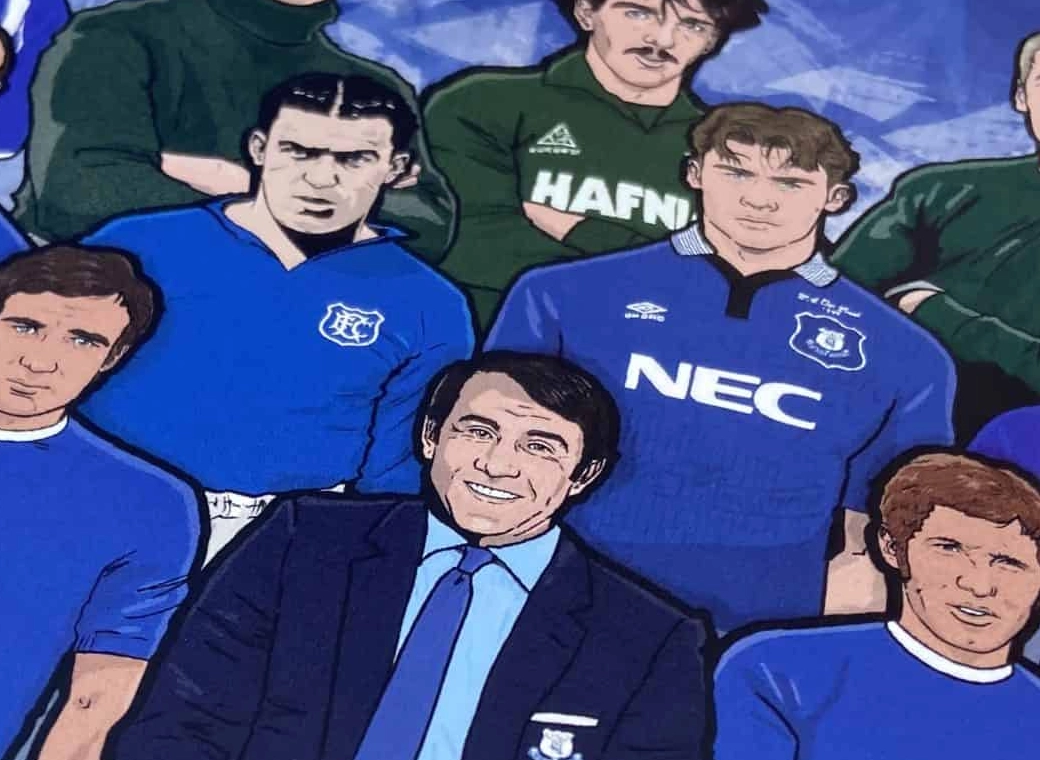
View attachment 266851
In fact, I reckon most peoples mums in Liverpool if they don't follow football would know that is Everton.
It's not even our proper tower.
I've bored everyone enough now - as I have in the past about that stupid minimal tower 'badge' but IMO, it's a mistake. When we get new owners, if they're competent it'll never see the light of day again.


