Install the app
How to install the app on iOS

Follow along with the video below to see how to install our site as a web app on your home screen.

Note: This feature may not be available in some browsers.


New Everton Crest Confirmed

Will the new badge make you buy more of the Everton merchandise?

  • Yes, I will buy more merchandise with this cool new badge.

    Votes: 18 3.7%
  • No, I won't change how much I buy of the Everton merchandise because of the badge.

    Votes: 67 13.6%
  • No, I will buy much less from the Everton store with this godawful load of ****e for a crest.

    Votes: 368 74.8%
  • no tears, only cheese toasties now

    Votes: 39 7.9%

  • Total voters
    492
Status
Not open for further replies.
Boy, this has got you angry.

Not really. Just a waste of time.

I guarantee anyone off this forum could choose for the rest of us a design that'd receive majority backing. If we can do that why cant people who work for the organisation? Do we think that if Alan Myers came up with a choice and presented it to us we'd all pretty much say 'yeah, not bad, go with that'? I think we would too. In other words they're making a song and dance out of this when they just need to act sensibly.
 
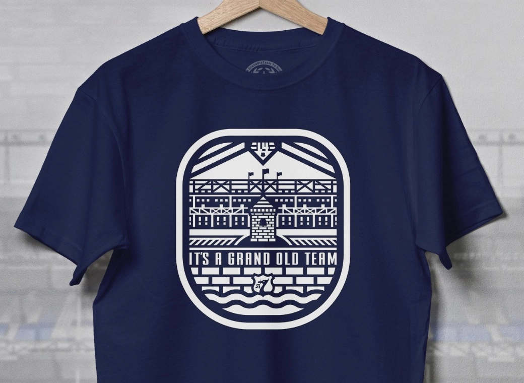
everton-badge-dribbble.jpg

i like that
 
There's no contradiction there. I was referring to how they'd been told umpteen times in the build up to that abortion's introduction that it wouldn't work and it should be stopped.

But then you say "Literally anything close to what went before would be acceptable.". Except they won't, the last two just don't work with the way crests are used these days. They are simply too cluttered. The last two with the motto underneath just look daft when reduced down, they look like a tower sticking up from undergrowth, the one before that was truly stupid but managed to last nearly two decades.

Its supposed to be a simple symbol of the club that can be scaled up or down without losing too much impact, not a history of the club.
 

The wreaths look out of place to me mate. Otherwise top effort (if you designed it).

My preference is still the brilliant design a few pages back that <goes to find it>

This:
2ziwsnp.jpg

Brilliant.


Aye those are beautiful, but they still lack the Nil Satis
 
Aye those are beautiful, but they still lack the Nil Satis

But we're not about Nil Satis any more. It's a complete piss take. What is Nil Satis about Everton since the 80s? I would have no problem jibbing it off and keeping it as a fond memory of when we were good in the 80s. Why have a motto that is completely not reflected in anything the club does?
 
The wreaths look out of place to me mate. Otherwise top effort (if you designed it).

My preference is still the brilliant design a few pages back that <goes to find it>

This:
2ziwsnp.jpg

Brilliant.

Actually, these I quite like, though I would lose the 1878 if it were me, we know when we were founded, don't think it matters to anyone else.

There is a comparison done near the start (here) that was designed to show up our new badge against the others, but whats interesting about it is the relative simplicity of the others. Few have any extraneous small writing on them (Chelsea is a bit of an exception) and they mainly go for a single symbol that people just associate with the club. No-one else seems to excessively go in for explaining how old they are, how they've won stuff previously or what their motto is, because that shouldn't be the role of the crest.
 
The wreaths look out of place to me mate. Otherwise top effort (if you designed it).

My preference is still the brilliant design a few pages back that <goes to find it>

This:
2ziwsnp.jpg

Brilliant.


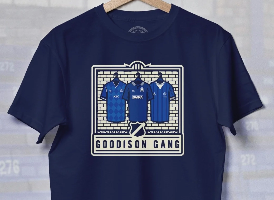
Thats a winner for me right there! I'd buy the kit if that were the badge on it.
 

Design isn't that easy. Pleasing our fanbase, universally, is even more difficult.

Unbelievable that someone as argumentative as you can't see that.

They did it without fuss for 93 years. Why everyone thinks they have to have input on this very simple task is beyond me. See that design on the previous page? That'll do. If they printed that on everything I'd guarantee the vast majority would accept it. It's THAT simple.
 
Aye those are beautiful, but they still lack the Nil Satis

2ziwsnp.jpg


I've said before about these, they're overkill. Far too much going on and would be awkward to replicate digitally and in the media, that's the key point here. It needs to be simpler
 
Last edited:

Status
Not open for further replies.

Welcome to GrandOldTeam

Get involved. Registration is simple and free.

Back
Top