OneTrueLegend
Player Valuation: £35m
I have been looking at all of the stuff online about this and the more I see the worse it gets.
I have read all of the stuff on the official site and tried to work out why the badge has been replaced with the new one. Reading between the lines this seems to be about cost. Effectively Nike and Kitbag are saying that they can produce everything more cheaply if we have a plastic "iron on" badge rather than a stitched on badge (it looks like and ironed on badge in that photo of the hoddie, someone else posted).
The problem with the iron on badge is, the more detail on them, the worse thy look, so they have removed all of the detail of the tower and the small writing on the motto.
To me having a simpler design isn't the problem, it's just the design they have come up with. It looks like a classic case of design by committee, rather than a pure design, like the Theo Kelly original.
To me, the Everton badge should always have, Prince Rupert's Tower and the two laurel wreaths, either side. That to me is instantly recognisable as "Everton". They have been on our crest since the 70's, so I would have thought from a "brand recognition" point of view, these would be the most important part as well.
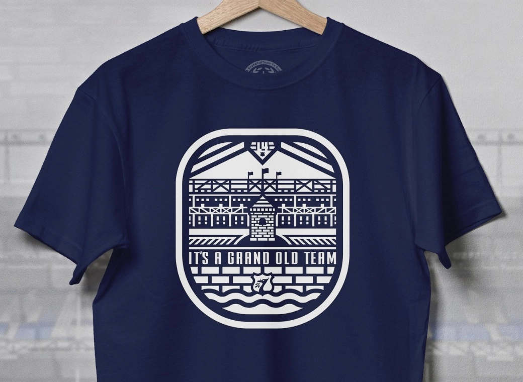
The other issue of changing the shape of the Tower, I just don't get at all. The club have said on the official website, that the new tower is closer in proportion to the actual tower. But we have been drawing the tower on our crest in a slimmer design since 1938, so its a bit like Disney redesigning Mickey Mouse and saying "The New Mickey looks more like a real mouse". It does'nt matter if it looks like the real tower or not, the new deign does'nt look like the tower we have been using on our crest for 75 years


